Brent Does… Painting? (An Inquisitor, Step by Step)
 |
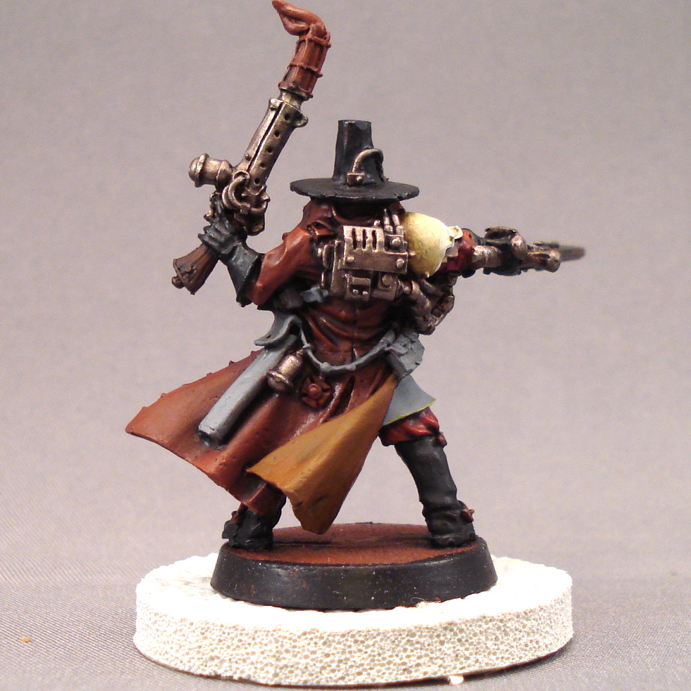
| “Hi, Brent!” |
Next week will make a year’s worth of Brent – articles, that is! Yes, ladies and gentleman, Unicorns and children of all ages, this article is #53, and absolutely none of them were what I call, “How to Paint” articles…
…until today. You’re scared? Hell, I’m terrified!
My name is Brent, and I write a little hobby blog called Strictly Average. Thanks to hard work and a hefty bribe, I’m lucky enough to write the Tuesday lead-in article – well, unless I’m usurped by a pesky ‘Big Red 5-Minute Rumor Post,‘ but what can you do? (Break things.) Point is, this is a monster blog…
…what if I screw up and drop another Scratch-Built Storm Raven post?
In the glory days of long ago, Brent thought himself a thought: “Ah,” he cried, “an idea is mine! And it will look like no other!”
Saying on, said he, “Fame I can achieve, on Internet and Blog, by turning talent on the truest of tests – the infamous Storm Raven!”
And so he did, and time flew by. So soon, his creation was ready, to drop on a public, all unsuspecting, who surely must embrace it.
And did our hero, all heroic, know even the slightest inkling of fear? No indeed, not he! “Let’s do this thing!” he said,
And published much excited! The Blogosphere did, with ponderous pointer, click on Brent’s creation. He held his breath, no breathing…
And after a hush he stood to receive what he considered his meritorious attention… the masses arose in mass to agree:
Advertisement
“What the hell is this crap?”
Yes indeedy, I worked hard on my creation only to meet with (almost) universal disdain. Dethtron dubbed it the Dyson Pattern Storm Raven, “Because it sucks. And it looks like a hand vac.” And he’s a friend! I gave it a facelift…
…and named her the ‘Gun Shy.’ Because I was. Having a model crapped on by the Blogosphere is a lesson in humility, let me tell you. The original Storm Raven post is my most-viewed Strictly Average article. Darn it all.
More recently, I tried to stretch my wings painting an Archon. I took on too much though…
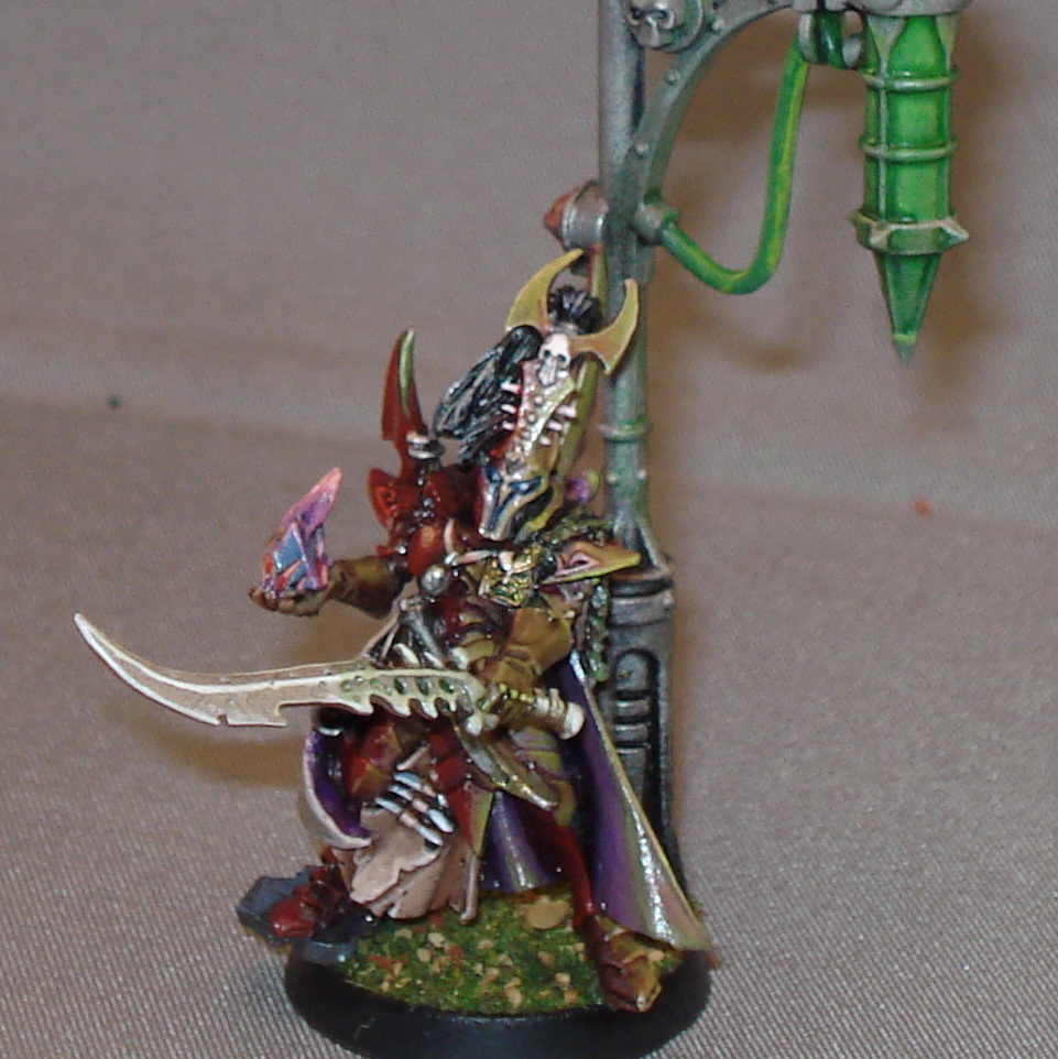
…and that didn’t work out so well. There were a number of problems with this model, my attempt at light sourcing a neon green glow off of a Dark Eldar’s red armor. Based on the feedback, the glow wasn’t appropriately diffused nor was it the right color. Many people also thought I was attempting a second light source from the Soul Trap in his right hand – which I wish I would have thought of but didn’t.
Back to the drawing board.
I have an infrequent series on The Blood Angels: By Jawaballs devoted to painting, and it’s where I drew this article. Keep in mind, the series is a personal inducement to attempt a greater degree of difficulty in my painting.
If this helps someone that’s awesome, but I’ll be equally appreciative of any feedback you brush-jocks out there can offer.
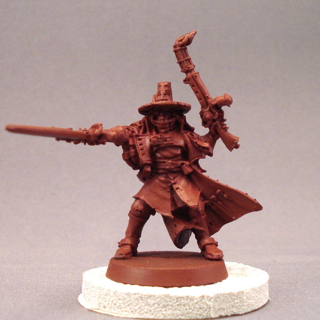 |
| As the model is predominantly brown, I used a reddish-brown base coat. |
 |
| I start laying down the basic colors in thin layers. I want the colors underneath to show through the layers a bit. To that end, I paint the kilt a bright blue, covering the brown… |
 |
| …before layering grey. Goatboy taught me that, once sprayed, the under-layers effect the tones above. For purposes of composition, this area needed to avoid the browns of the rest of the model. |
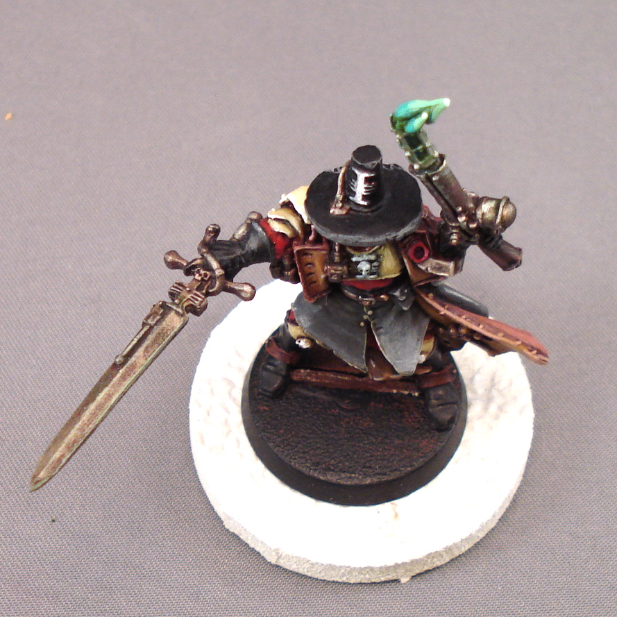
I’ve been taught that triangles are an important element of model composition, and this dictated some of the color decisions here. I wanted a ‘no nonsense’ Inquisitor with workmanlike gear – meaning earth tones. Anyway, I wanted the weapons to be metal, which appears greyscale, right? I hoped to balance that with the kilt, making an upside down triangle.
 |
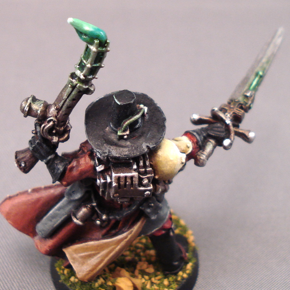
| The back. I was attempting a plastic look for the Carapace armor and wanted well worn metals with sharp highlights. |
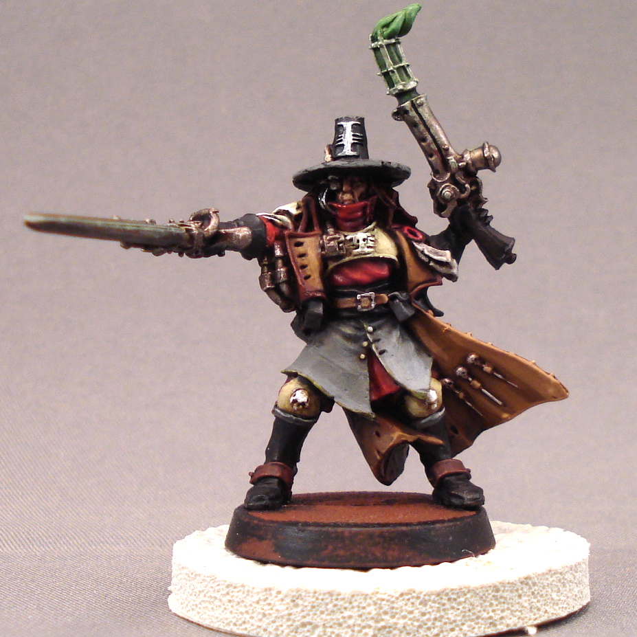 |
| By this point, the colors are all in place and its simply in need of highlighting up. |
 |
| By this point, the Inquisitor’s face is almost done. |
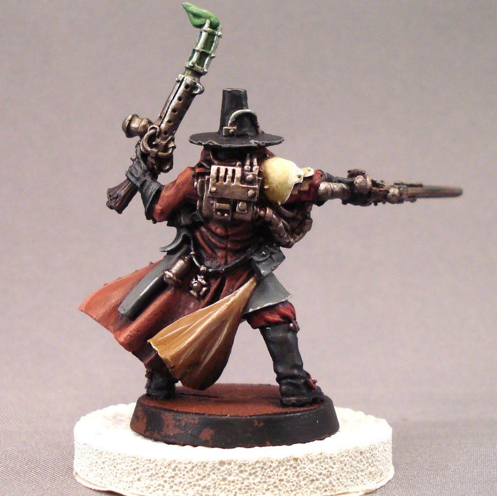
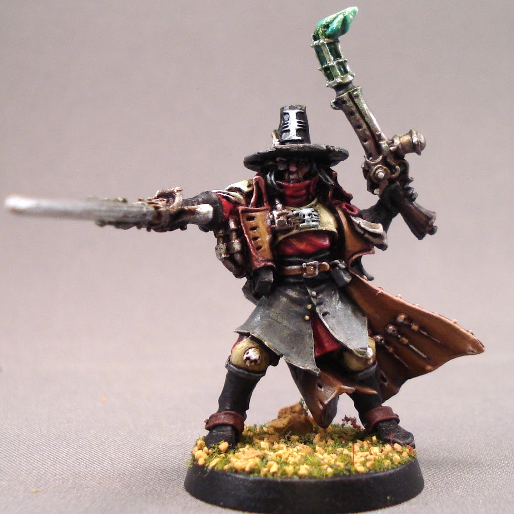
I’m aware these pictures appear dull on the computer screen, but using the flash creates artificial colors. I did this on the lead-in picture so the face, hidden under the hat, is visible, but the actual color is show in these step by step shots.
 |
| The back again. The inside of the coat is a different shade of brown, but I also painted it in a different style. It’s been pointed out I sometimes use extreme highlights which appear ‘cartoony.’ I cleaned it up a bit, but that’s probably a true knock on the finished product. |
 |
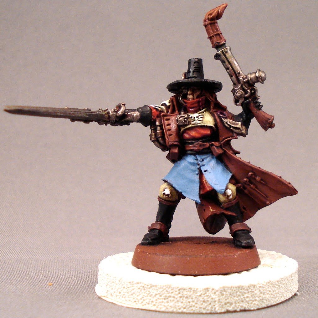
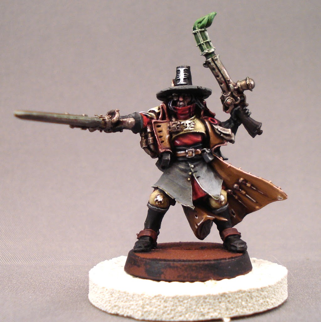
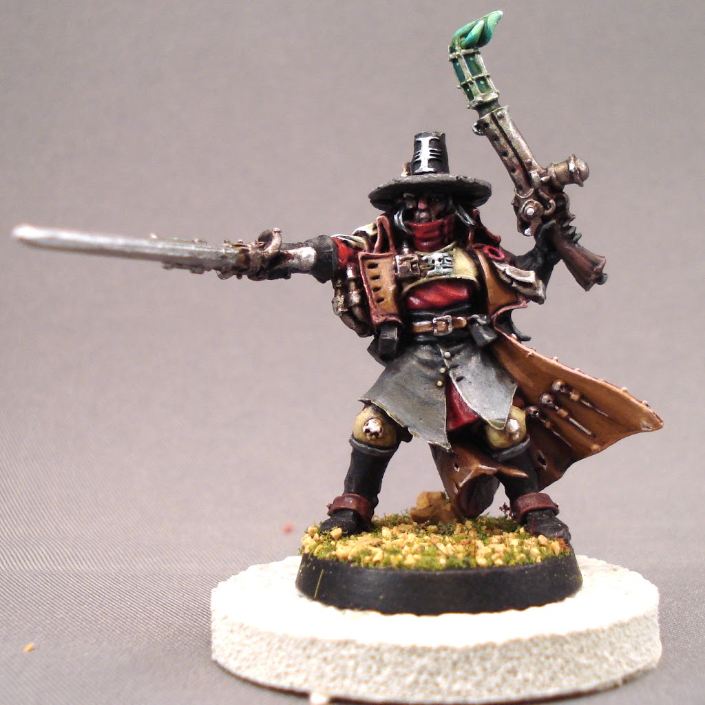
| I reached the stage where I had to make a decision about the Power Sword. After some thought, I determined I’d blend Boltgun to Chainmail to Mithril, from the base to the tip – a classic look with no ostentation. |
 |
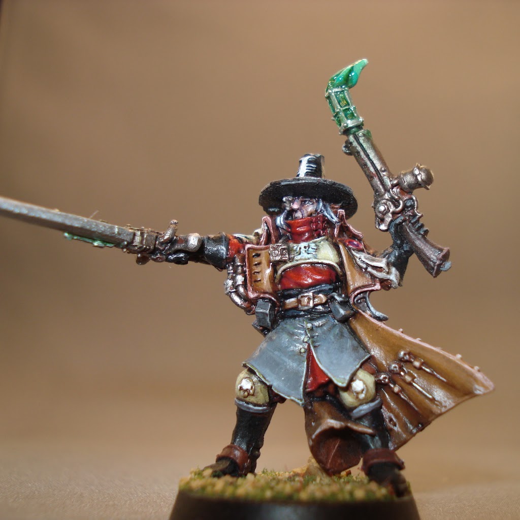
| The model is basically done, but there was some minor cleanups and color corrections here and there. As I recall, the brim of the hat bothered me some, and I spent time on the Inquisitor symbol on the chest. I considered changing it, since white didn’t exactly jump off the color I chose for the Carapace Armor, but in the end I just defined it a touch. |
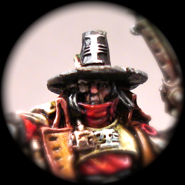 |
| Here’s an extreme closeup of the face. |
 |
| Here you can see the highlighting on the metals and the final look of the Power Sword. I did only very subtle highlights of green from the two weapons – far cry from the Dark Eldar above! |
 |
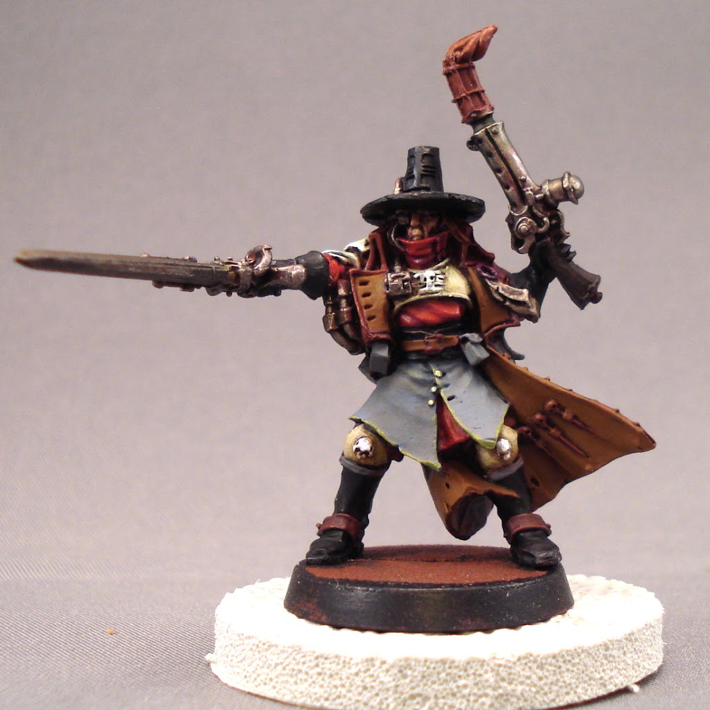
| I spent entirely too much time trying to get these pictures right! Compare this with the picture below and you’ll see the difference between flash and no flash. |
Thanks for taking the time to give this a once over! I welcome any comments you might have, such as…
Was the color scheme natural or too natural? Where can I improve my technique? For beginning painters, was there anything here that helped?
Thoughts? Comments? Hugs and gropings?