HOBBY: Painting Convergence Heavy Vectors
9 Minute Read
Aug 9 2013
Advertisement
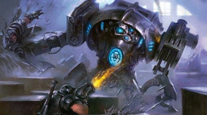
If you saw my last post and suffered through the monotony of cleaning and magnetizing your heavy vector models, welcome to flavor country, friends: The Vectors are pretty fun, and pretty simple to paint!
It’s been about a month since The Convergence’s official release, and I’m starting to feel pretty confident in my painting techniques for them, so let’s get to it!
Because the Convergence is a really visually cohesive faction, I think it’s important to break down the elements that all of the models have in common, and that is:
Armor ~ Vast majority of the faction’s surface area, this will be the primary color (Silver is the clear choice for me)
Gears, Extra Plates, Gizmos, Do-dads~ Good opportunity for a secondary color (I’ll go with gold)
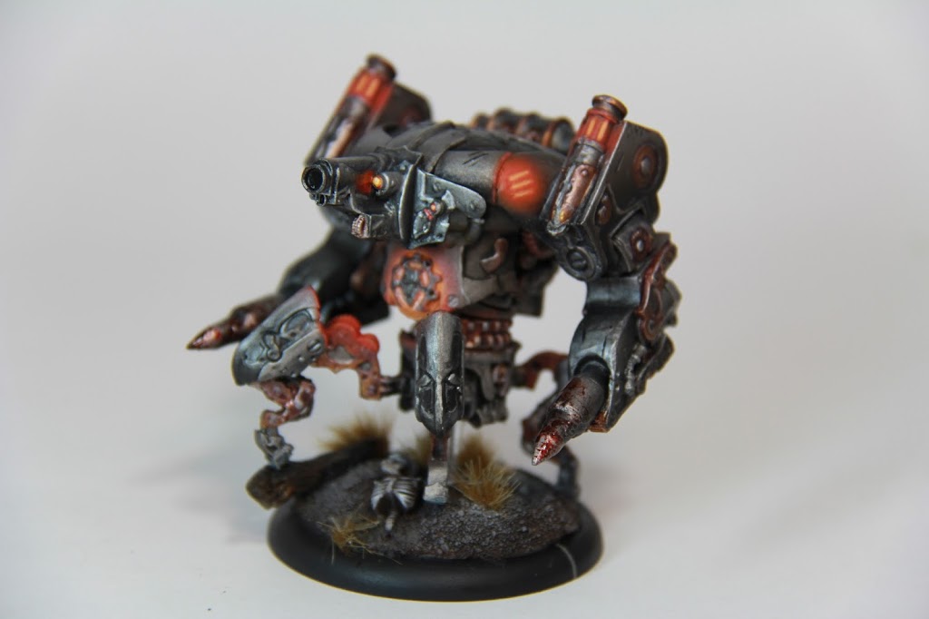
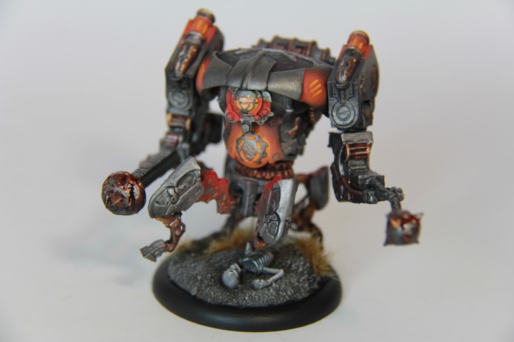
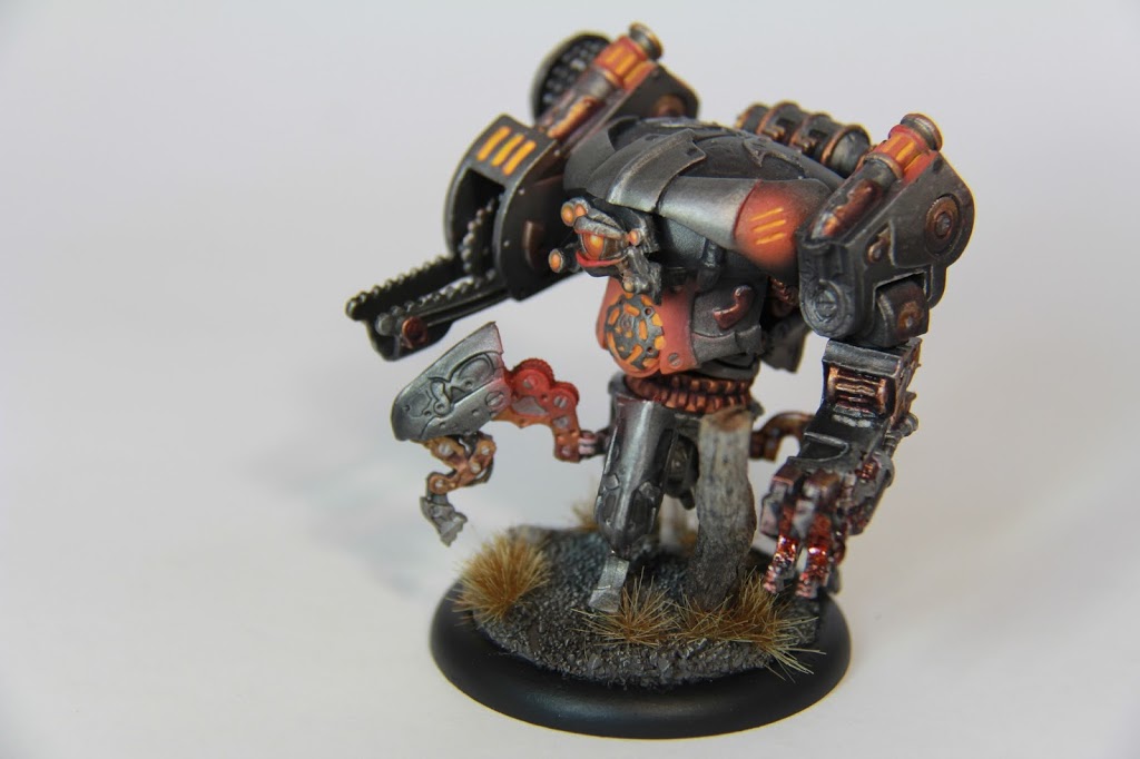
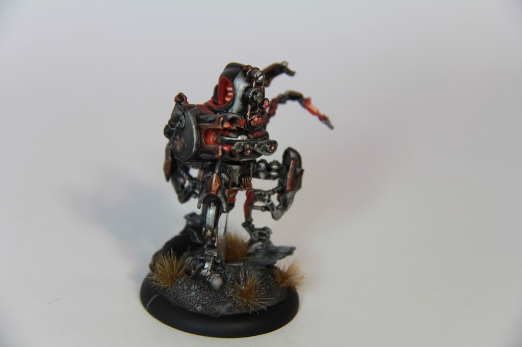
Glow~ Cryx and Retribution both illustrate how strongly a glow effect defines a color scheme. The studio scheme calls for a blue, but I’m opting for a more menacing red.
With all that in mind, I’ve got a pretty good idea of how the color scheme for the faction will come together.
Just like the Stormblades I painted up a while ago, the Vectors present a great opportunity to airbrush! In the past, I’ve really only used the airbrush as an expedient basecoating tool, but with these models, I’m trying to get into actually painting with it, so bear with me while I work my way through the learning curve.
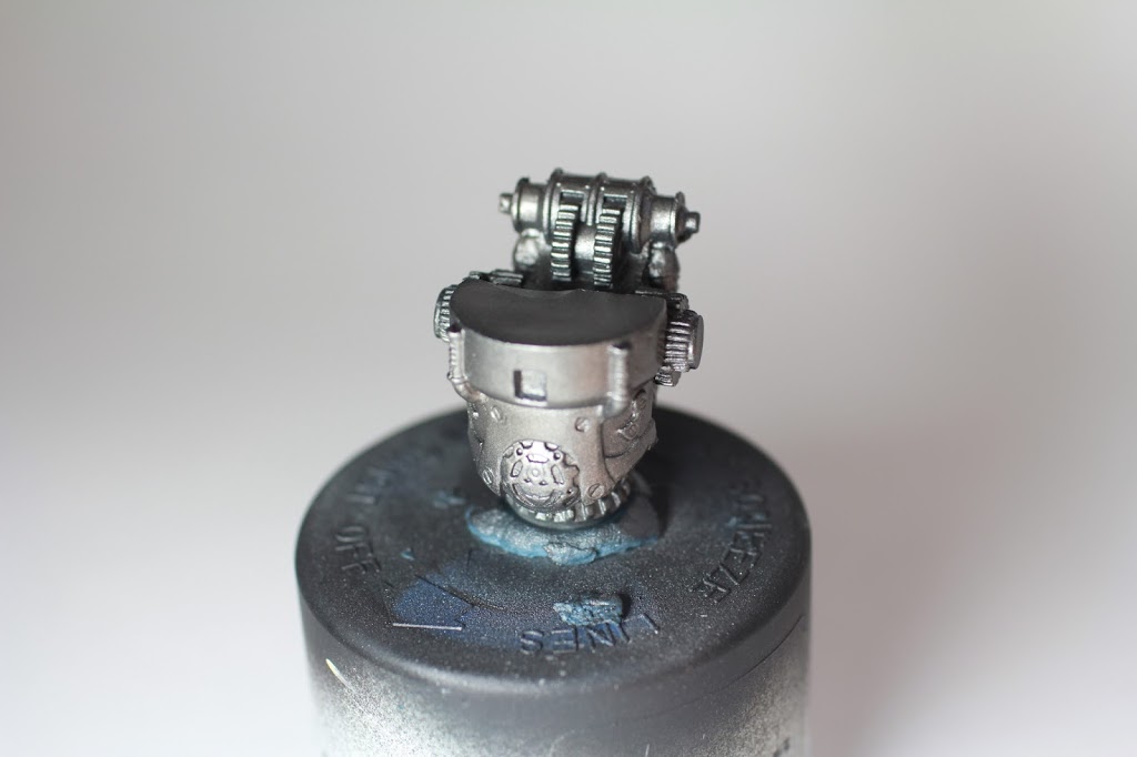
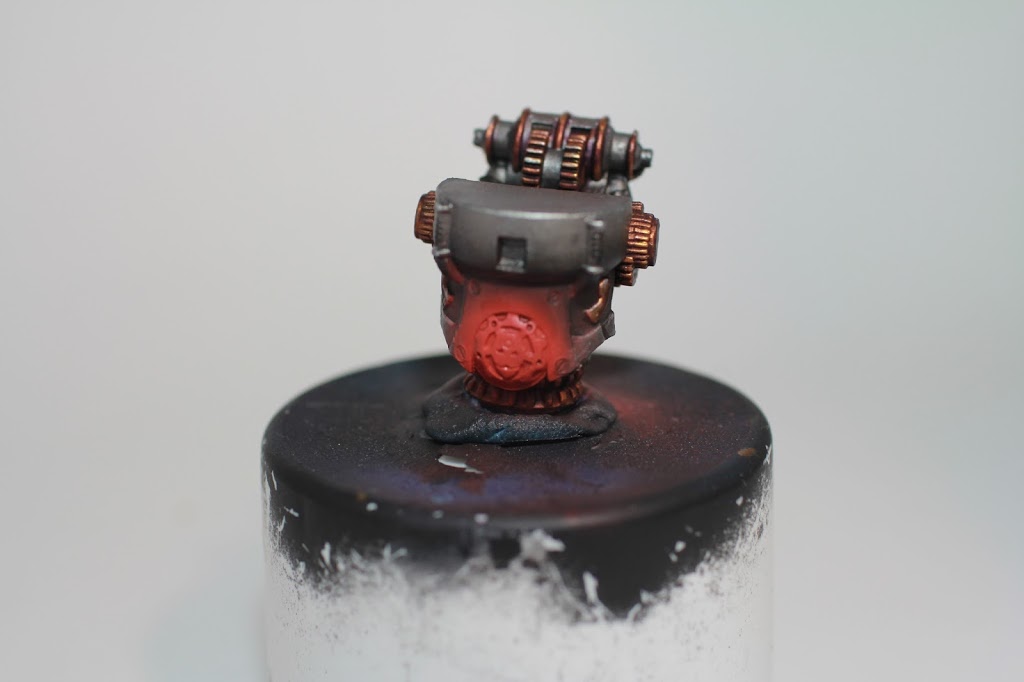
So, first step is easy-peasy. Over a black primer, I mix 1:1:1 GW Leadbelcher, Liquitex Glaze Medium, and Vallejo Thinning Medium. Sometimes, when airbrushing metallics, they dry too quickly on the model creating a textured, grainy appearance. The glaze and thinning mediums keep the paint liquid-y long enough to dry as a smooth coat. I was skeptical too, but damn, it really works.
Once the first coat dries, I lay down a second coat of the same 1:1:1 with GW Ironbreaker instead of Leadbelcher. Because it’s sort of thin, this doesn’t look significantly different, so much so that I didn’t bother taking a photo of this mini-step. As I’m typing this up, I realize that it may be a good idea to skip this step, as Cyriss models have quite a lot of shallow detail that can become obscured if you lay down too many extra layers.
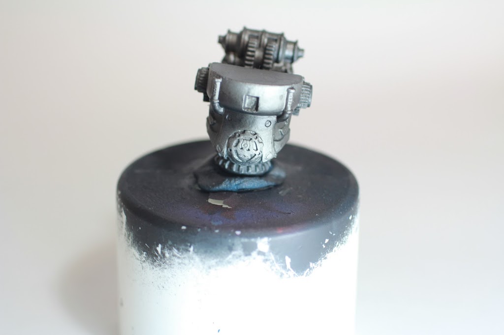
From there, I wash the airbrush out really quick, and put in some straight Nuln Oil. I apply this to create shadows where I want them, and also to create a two-tone metallic effect to break the silvers up and make them more interesting.
Once the first coat dries, I apply a second in the same places to darken them further–two coats gets pretty dark. Too many layers will obscure detail (especially the really shallow stuff on the top of the carapace) and make the shadows way too dark.
If the two-tone areas do get too dark, a quick dusting of Leadbelcher will reclaim some of the metallic-ness lost.
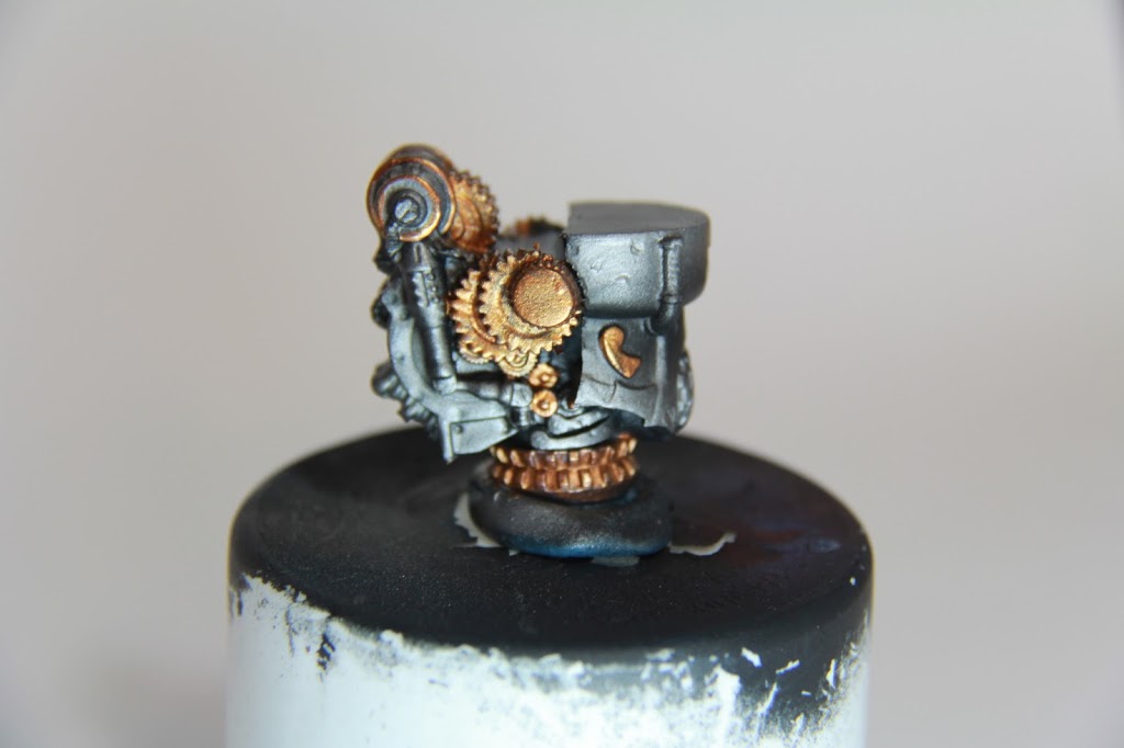
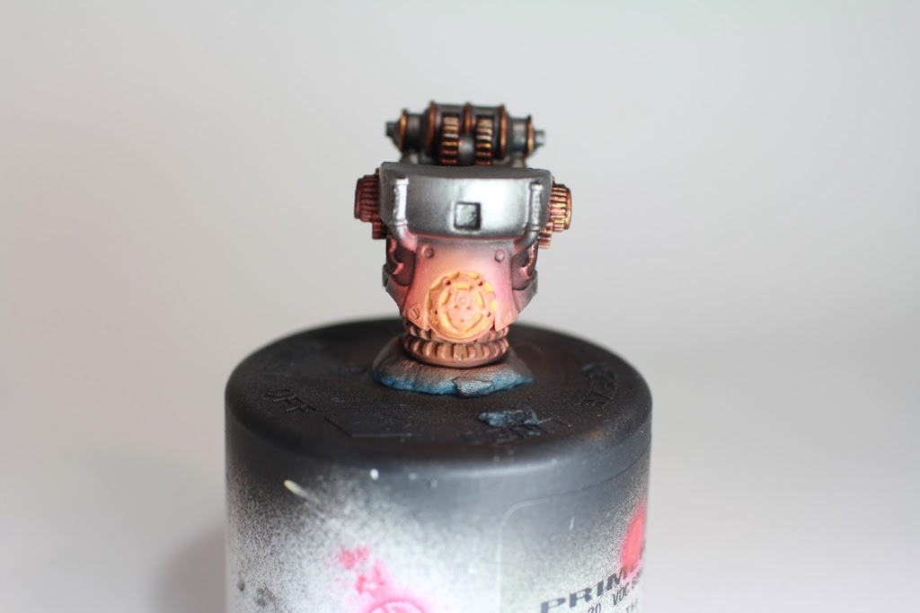
If the shadows get too dark, I go back and forth trying to create a gradient– First starting back with leadbelcher to smooth the transition from the Nuln Oil into the silver, and then Ironbreaker on top. The above picture shows a decent gradient on the far left, a really poor one in the middle, and the absence of one on the right (that being said, if the shoulder is facing downward, this might not be a bad thing).
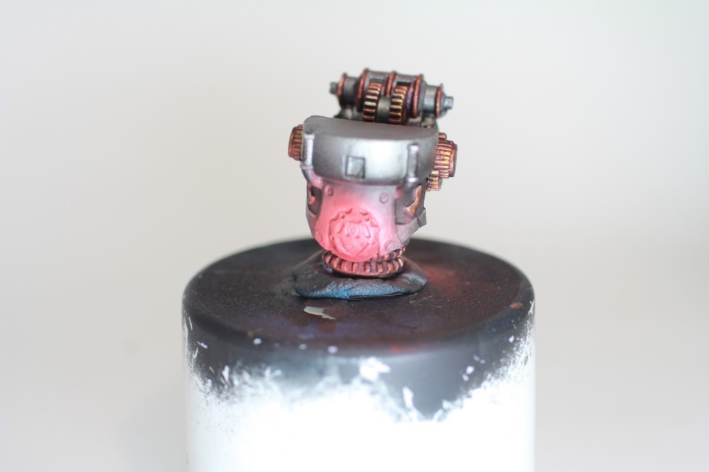
There’s a little bit of back and forth to lay down the basework, but once you get a feel for it, it goes pretty quickly. For the above piece, where I’d already started with Golds and didn’t want to airbrush for fear of messing them up, I found that in a pinch, two-brush-blending the metallics can help to create an OK gradient.
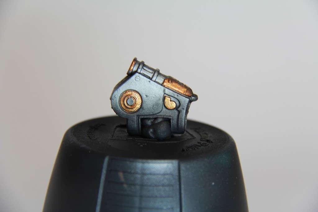
Once I feel good about the silvers, I move on to the golds–Picking out all of the gears, and some extra trim pieces with P3 Molten Bronze– I do this as carefully as I can, but as with anything else I make mistakes. If I catch them quickly I’ll scrub them off with a wet brush I keep nearby, if not, I’ll clean up later!
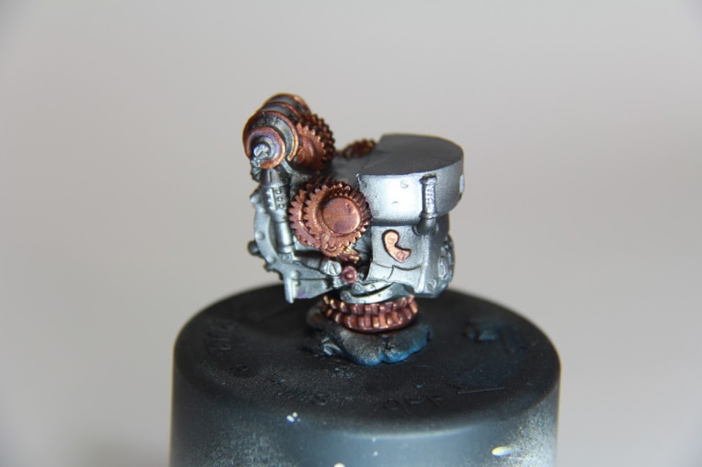
Next I wash the gold areas with Druchii Violet–without going into too much detail, color theory says that shading with a color’s complimentary color is good, and the purple wash works pretty well with the yellow-y golds. I know it sounds weird, I was skeptical too, but give it a shot, it’ll really help your paintjobs out.
That being said, the approach I took here isn’t the best. The goal, like the silvers above, is to create a gradient. What I should have done is two-brush blended the Druchii Violet in order to create these shadow gradients, rather than start with an indiscriminate wash, adding more layers to obscure this model’s already shallow details.
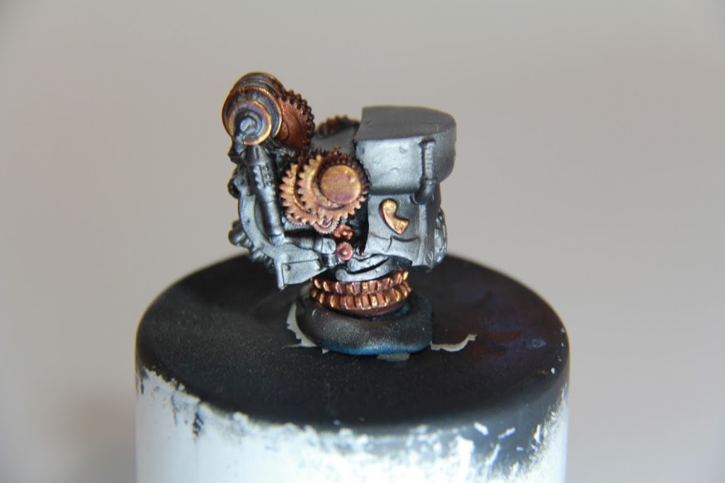
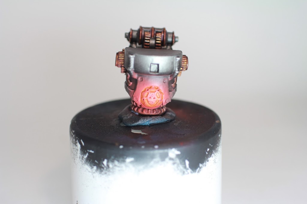
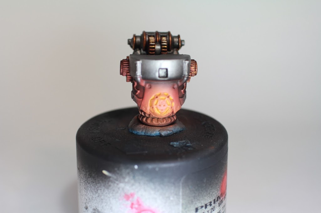
Here you can sort of see my way of fixing this, I started out by highlighting with P3 Rhulic Gold, trying to give the areas the beginnings of those color transitions that I’m hoping to achieve.
In this somewhat-overexposed photo you can see what my endgame looks like for the golds. After the last highlight, I go back and two-brush-blend Druchii Violet up from the shadows to try and create that gradient I’ve been talking so much about.
Once I’ve got that settled, I take some Runefang Steel and edge highlight all of the metallics (read: the entire model). They key here is to get only the edges that face upward-ish, where they would be reflecting light. Where the gold is concerned, I hope the photo illustrates the desired effect of a gradual modulation between the purple-ish shadows and the pale gold-to silver edge highlights.
Now we move onto the part of the painting process that will really define the models: the glow.
I’m going with a red glow, which is a little problematic, I’ve found. The brightest part, closest to the source of the light needs to be significantly brighter than the rest of the glow, and the whole glow needs to be brighter than the rest of the model. With blue, you can have the brightest area white. With green, the brightest area can be yellow (or white for a pale green). With red, if the light source is white, the glow looks pink, if it’s yellow, it looks orange. I’m still looking to optimize my method, but what I’m turning out right now is more orange.
First I load some Evil Sunz Scarlet into my airbrush, and go around the model blocking the glows out. This is sort of a delicate process… it’s important to err on the side of too little glow, the focus is mainly on getting the glow area to have a clean blend into the surrounding areas, rather than a hard outline.
Next I grab some Khardic Flesh and mix it 50/50 with Evil Sunz Scarlet, this will make much pinker color that will help tie the red and eventual orange together more (James Russell, a phenomenal painter out of Dallas gets credit for mostly the whole glow recipe, but especially the Red, Pink, Orange idea). The idea here is to take this mixture and cover like 80% of the initial glow area.
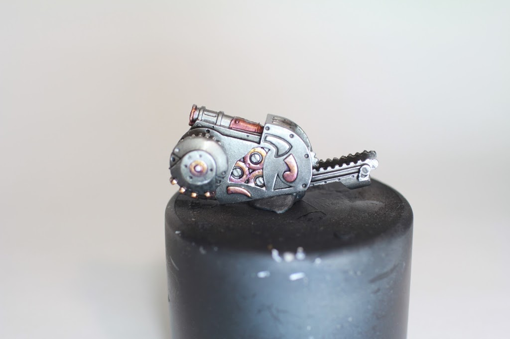
Next I’ll start developing the light sources themselves. I take some Troll Slayer Orange and thin it down quite a bit, and apply it to all of the light source areas– On the heavy vectors these are the slits in vents, and the face in it’s “stomach”
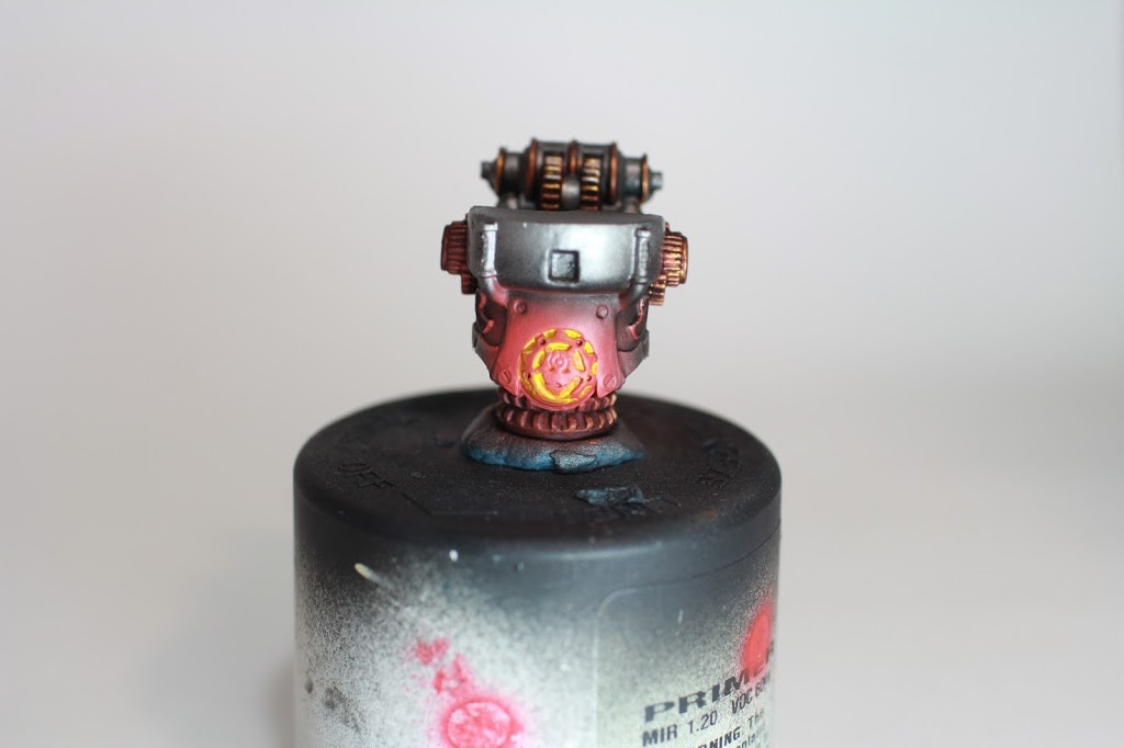
After the orange, I take some Flash Gitz Yellow and do the same thing–Thin and apply to the light sources. BUT ALAS I screw it up. Before, there was some softness to the effect, but the contrast between the yellow and the red is baad. But, I find WIP models always get worse before they get better.
The first step toward fixing it is to take P3 Menoth White Highlight and put it into the light sources over the yellow. I forgot to take a picture, but it looks pretty bad after this step, too. Hang in there!
Now for my triumphant return from mediocrity! I mix Troll Slayer Orange and Flash Gitz Yellow 2:1 and airbrush that onto the central 60% of the glowing areas. The Menoth White Highlight in the light source areas will come out light enough to be the source of the light, but this step regains the softness we lost before.
Next, I mix Troll Slayer and Flash Gitz 1:2, and lightly airbrush that into the middle, aiming to cover even less than before, and give the glow a solid finishing touch.
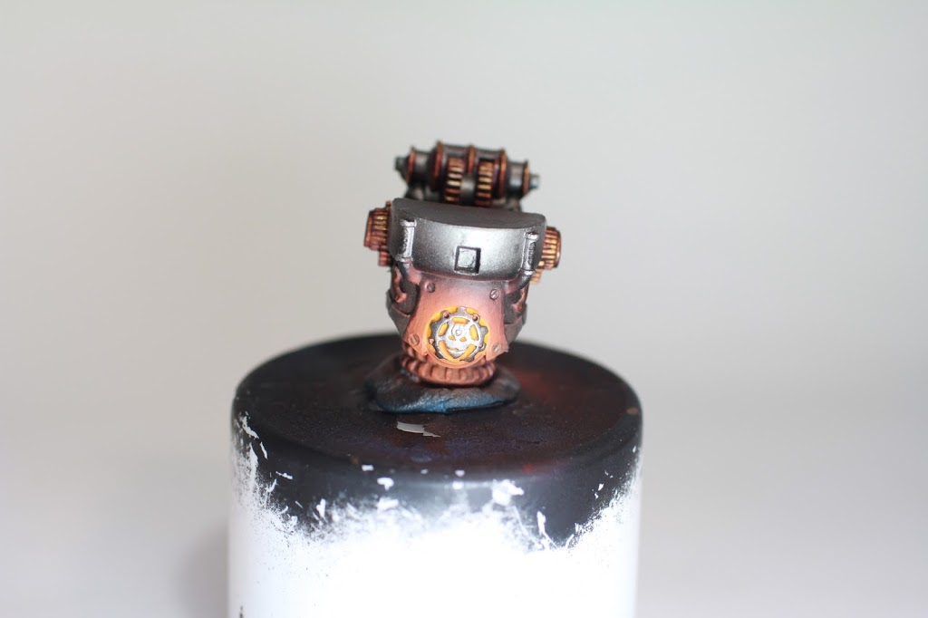
The last bit on the glows is to take Leadbelcher and clean up the glow where I don’t want it, like the stomach-face plate. As I’m doing this, I leave the overspray on the edges of surrounding plates (hopefully you can see what I mean in this photo), as those would reflect light even if the area of the glow doesn’t extend that far. I think this step is where the model really comes together as a whole and starts looking good.
After this, I go back around the model touching things up, paying special attention to the transitions between light and shadow: making sure they’re gradual enough, that they happen in the right areas, etc. Flat edges near glows get an edge highlight of 1:1 Evil Sunz Scarlet and Khardic Flesh.
Once I feel pretty good about all that, I hit the model with a few coats of Liquitex Gloss Varnish through my airbrush, and then a light dusting of Vallejo Satin Varnish the same way– I don’t recommend using matte varnish!! Matte will turn all the Silvers into these lackluster greys— on a model with less metallic surface I wouldn’t be as concerned, but because the whole model is metallic, we need some sheen. Satin Varnish really does the trick here, without being as overpowering and garish as Gloss.
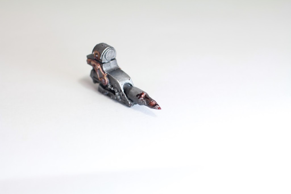
As a little freebie for you guys, I thought I’d include a fun finishing touch I used on my killer robots: the blood splatter. This little bit of tech is pretty well known around the internet, but in case you haven’t seen it before, the magic is all in Tamiya X-27: Clear Red.
It’s sort of a chemical-y smelling paint, so be careful, but the idea here is to mix it with something to make it more “real.” I do something like a 2:1 mix of Clear Red:Thamar Black, which looks pretty visceral. Once I get that all mixed up, I dip a toothpick in to the paint and get a little dollop on the end, then take my airbrush and shoot a burst of air at the dollop: BAM, blood splatter.
I experiment with it a few times before going to the model with it, but I’m careful to keep a scrubber brush nearby in case things go awry. The other thing I like to do is switch up the color halfway. Once I get some of the Clear Red/Thamar Black on the model, I mix probably about 2 parts more Clear Red in for brighter blood, and do it again: this varies the look for a somewhat more realistic feel. The last thing is that the paint will dry glossy, so unless you want the blood to look dry, make sure you put it on after you varnish.
Once I’m done with all that, I’ve got myself a painted model!
Thanks for bearing with me while I’m still figuring out my Convergence painting method! Hopefully upcoming tutorials will be explained and photographed a little bit more clearly, but if you have any questions in the meantime, ask me in the comments and I’ll get back to you! Next time I’ll be showing you how I do my Cormac McCarthy-style bases pictured above. Until then, how are you guys painting your Convergence models?
Author: PeanutButterConspiracy
Advertisement