SHOWCASE: Ogrun Assault Corps by Gentleben
Sometimes you have to stop and appreciate the details. Put on your glasses and follow along.
Ok first of all, this isn’t a step by step tutorial. If you want that, grab a paintbrush and go here. We are here today to talk about color choices, techniques, and overall presentation.
One of the things that many painters struggle with is color choices. It is so easy to want to just go all “paint by numbers” and throw tons of colors at models. Even with an amazing technique, you often end up with a garish figure that is hard on the eyes. On the other end of the spectrum, I have seen armies that look stunning from 6″ away, but have such drab and narrow palettes, that people just walked right past them – headed for lower quality but more contrasty fare.
 |
| So many bright colors! |
As a painter, always think about that double edged challenge before you start in on an army. You want colors that will draw the eye from across a table, and get people to come over and take a closer look, but you don’t want something so garish they wont like the results when they come take a closer look.
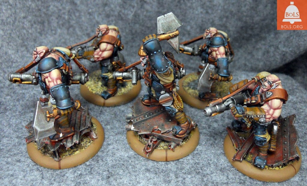
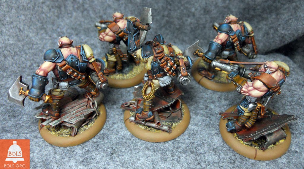
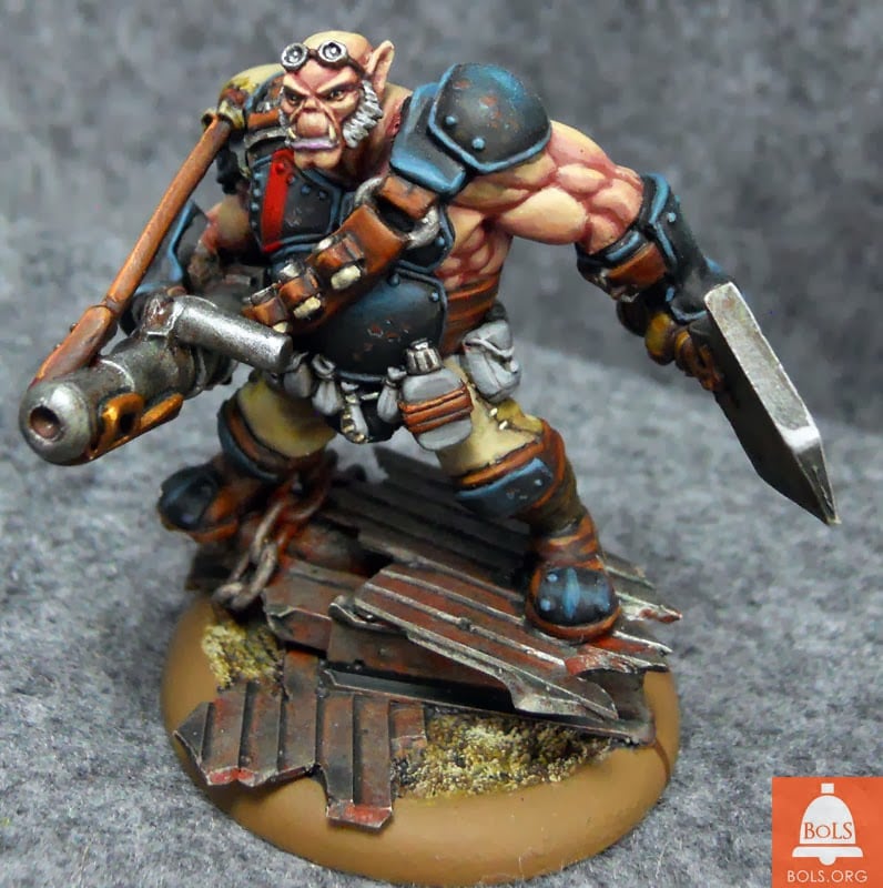
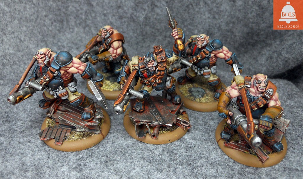
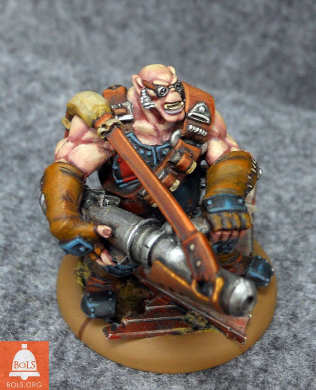
Gentleben has chosen a “naturalism” type of palette here, with organic browns, subtle blues and rusty reds. It all works well together, gives the Ogrun a warmth that draws you in and yet he was still able to throw in some very limited and controlled details like the bright red stripe on the chestplates. Just the type of thing that can draw the eye.
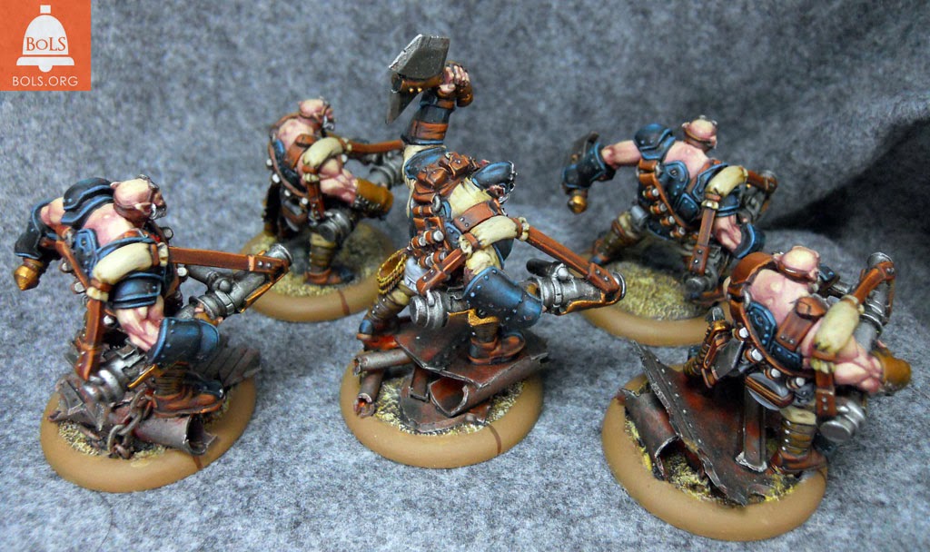
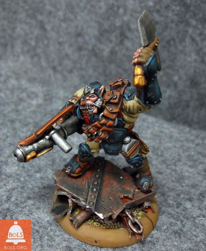
The next thing I want to point out to you is something that is hard to put your finger on, but once you know the trick will kick up your painting quality greatly. One of the things Gentleben does is use blending and multiple layers of thin paint to build up to his final colors. While many of us don’t have that attention to detail, one of the side effects is that you rarely see pure neutrals in his finished works. Even most of his metals are painted thinly over very light shades of color, giving everything a teensy bit of hue.
And THAT is a big deal, because here’s a quick trick that will save you 4 years of fine art school. It is virtually impossible to find true neutrals in nature. Due to the ever-shifting hue of light at various times of day, or the wavelength of artificial bulbs, you virtually always see everything in your life with at least some color in it. And the side effect of that is when trying for a sense of realism in painting true neutrals often “feel wrong” You can’t quite place your finger on it, but the eye tends to view these tones as somehow off.
So bravo to Gentleben for sharing these with us and showing us how much you can pull off with a controlled palette.
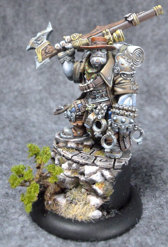
Finally, this set of miniatures exist along a continuum. Many of the techniques that Gentleben used to paint these Ogrun, were greatly improved and can be seen on his stunning Hunters Grim here and here.
See practice does pay off. Have at it.