40K MASTERCLASS: Painting a Banshee Purple – part 1
4 Minute Read
Aug 15 2011
Advertisement
Howdy all. Today I start the first part of a series of project logs on various models and armies I have and am working on. Today is my Howling Banshee model I entered in the 2008 Golden Demon.
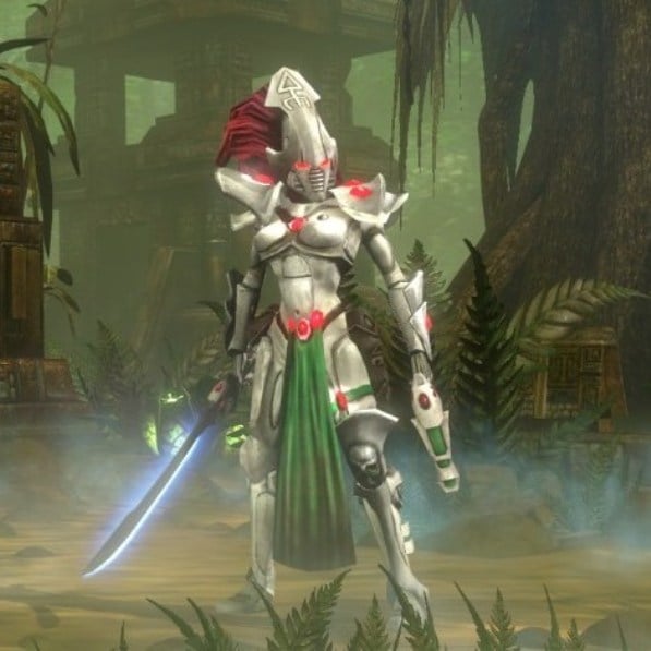
Ever since Mike McVey did a howling banshee model in the early nineties, these have been one of my favorite models through the different incarnations and designs they have had for at least the last 20 years. Similarly, that same model,( I wish I had a picture), was one of the first models of an alternative color scheme. At that time, and currently, howling banshees are bone colored. This oldie but goodie had black armor and white colored hair. Ever since then I have been a big fan of alternative paint schemes for almost every army I have ever done.
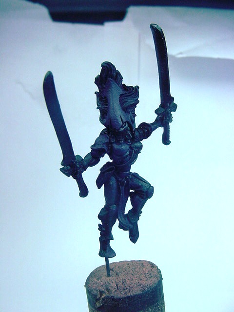
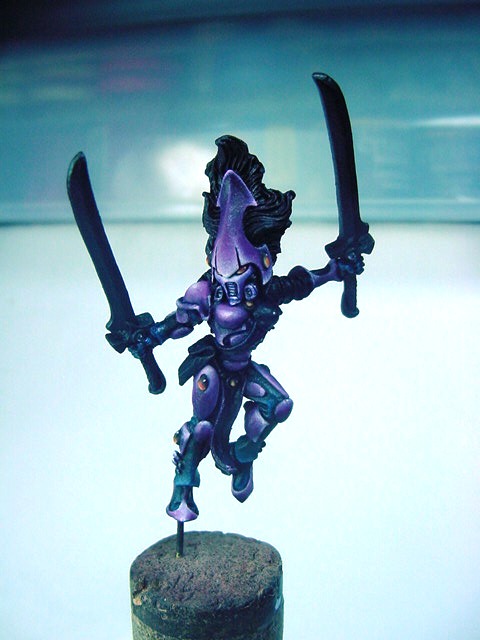
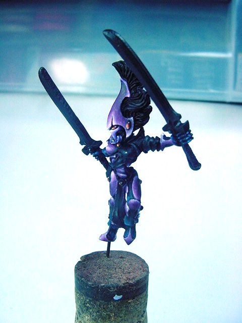
When I went to my last Games Day Golden Competition in 2008, I wanted to enter a howling banshee. To make it stand out, I opted to paint it primarily purple with a contrasting gold armor detail. I began with a lower body conversion between a couple of different banshee models and did an arm swap so my model would look like it she was at the ready and looking for her next opponent.
The model was primed in black as it was going to be a primarily dark model and black primer is best suited to this end. The base color I used for all of armor is Vallejo Red Violet. This is a great color that blends very well and gives off a reddish warm hint to the purple color.
From here P3 Morrow White was added to the base color and wet blended together on the model. It got gradually lighter towards the edges and raised areas till it was near white. Once this was done, I glazed in successive layers all the purple areas with GW Leviathan purple ink and Asurmen Blue. What these colors do is gradually darken the model, which was looking just a little bit pink and cool the color so that the shadows on the model are emphasized more than they might be on their own in reality. Once I got the shading where I wanted, I went back and touched up a little with the violet red and then added GW Skull white to the very tips and edges. The reason I use both P3 Morrow White and GW Skull White is the saturation of the paint. Saturation is the intensity of the color. Its what makes reds redder or whites brighter or…more intense.
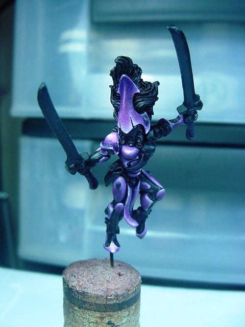
To tie all the colors together, a final shade of the old GW Blue ink was used in the darkest areas to darken the shadow, such as under the breast plates, under the top of the helmet and on any part of the model that was facing down toward the ground.
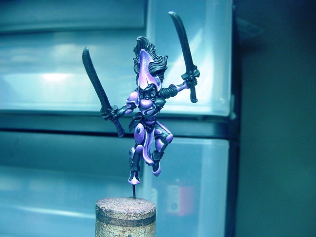
As an accent, I chose to use a bright orange as the primary color for the jewels on the model and to use a cool lavender color for the face mask. The orange is a natural contrast color for the purple. Actually, yellow is the contrast color for purple, but the jewels are an accent and not a dominant piece and since both the purple and orange have red in them, it minimizes the competition between colors and makes the transition a little more smooth.
The lavender facemask kept the purple color I was working with, but removed the red aspect of it. This makes the helmet a cooler color, and brighter at the same time. With the pure white edge highlights, it makes the facemask the center of focus for the viewer’s eyes as most of the white edges point toward the lighter colored facemask.
That’s it for now, next time I will go over the body suit and the gold armored details.
What things to you all find as a challenge or daunting? Drop me a note, I’m more than happy to offer my thoughts on painting minis or models!
Advertisement
Author: Guest Columnist
Advertisement