WFB HOBBY: Painting Black the Cool Way
4 Minute Read
Aug 17 2010
Advertisement
Howdy. One complaint I hear a lot is about black and how it is never quite dark enough. Let us discuss the darkness that is black.
Black is the darkest color there is. While this may seem fairly obvious its actual application in painting more often than not seems to the contrary. Often black is just highlighted or dry brushed with codex grey and that is the extent of it. While this does yield decent results, there is so much more than can be done with a little more effort and time. None of what I am going to talk about is difficult or tedious, but it will make a big difference.
The trick to using black is to use a lighter color mixed in with black. I am using GW Chaos Black with a little bit of GW Hawk Turquoise. I am continuing on the same model I used for my white article. The model is going to be part of my Ostland army and the entire army will have black lacquered armor instead of the mode traditional metallic.
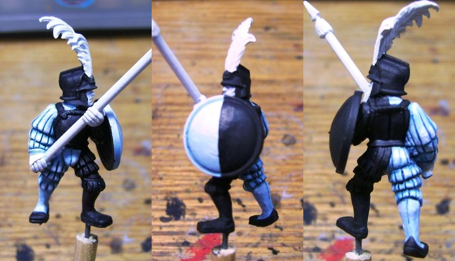
Step 1: Apply Chaos Black to the entire areas that are going to be black. For this model, and Empire Spearmen, this is the left side of his body and his armor and half of his shield.
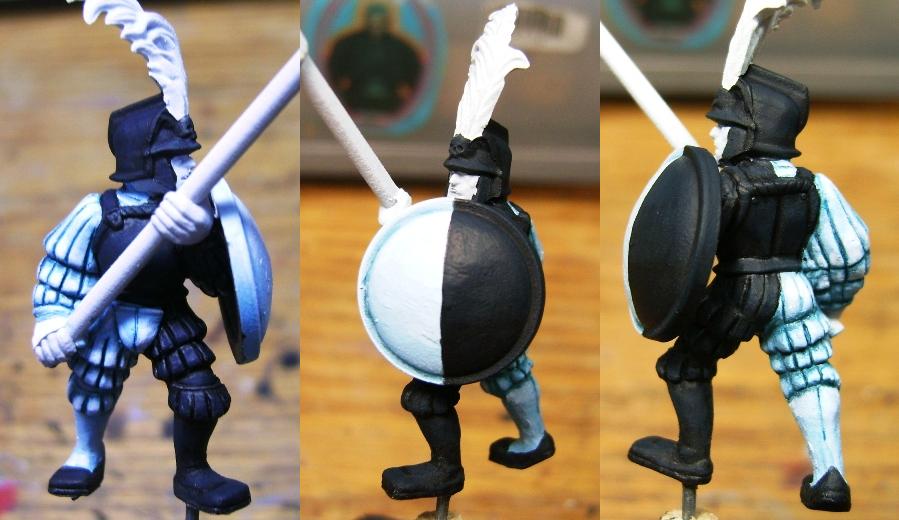
Step 2: Make a mix of Chaos Black and Hawk Turquoise. The mix ratio is 3 parts black to 1 part turquoise. What this does is lighten the black enough that it still looks black without actually being black.
The lighter color is applied like a base color all over the dark areas except where we would want to shade, so be careful not to get any in the cracks and crevices.
I use Hawk Turquoise specifically because of the way it mixes with black. Other colors can be used as well, especially if you want to get other effects or tints to the black base color. However, if you want a deep dark black, Hawk Turquoise is my recommendation as a mixing color choice. It seems to have the right amount of brightening effect without dramatically changing the color. I know that some may be thinking white is the ideal color to use to highlight, but in all honesty white tends to make more grey than turquoise does and it definitely changes the end result.
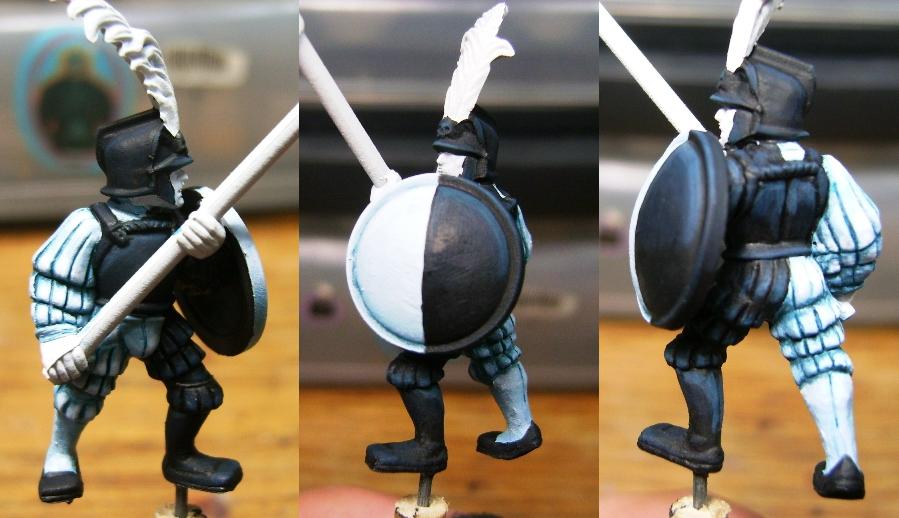
Step 3: Add more Hawk Turquoise to the mix. The ratio should be 3 parts black to 2 parts turquoise. This is applied as a final highlight to the raised areas and edges of the model.
Step 4: The basic coloring is now complete, now we shade by going back and adding several layers of Badab Black or 1 layer of P3 Armor wash to the cracks and crevices to help emphasize the shadow. I use a fine tip brush to ensure I get the ink where I want it and not over the lighter colors I have built up over the previous steps.
We have now completed painting black on the fabric, armor and shield. For the armor, once I have sealed the figures I will go back and apply a thin gloss coat so the armor will stand out against the fabric. One thing on this color palette is the use of black and white. The strong contrast of the colors emphasizes each color. To tie the entire figure together I used bluish shades and highlights. So while the main colors are complete opposites, the mid tones (shades and highlights) are very similar and give the entire model and the subsequent army a cohesive feel.
What things to you all find as a challenge or daunting? Drop me a note, I’m more than happy to offer my thoughts on painting minis or models!
Author: Guest Columnist
Advertisement


