Howdy all. Today I would like to continue on frompart 1 of my series on painting a competition quality Howling Banshee model.
Ever since Mike McVey did a howling banshee model in the early nineties, these have been one of my favorite models through the different incarnations and designs they have had for at least the last 20 years. Similarly, that same model, I wish I had a picture; it was one of the first models of an alternative color scheme. At that time, and currently, howling banshees are bone. This oldie but goodie had black armor and white colored hair. Ever since then I have been a big fan of alternative paint schemes for almost every army I have ever done.
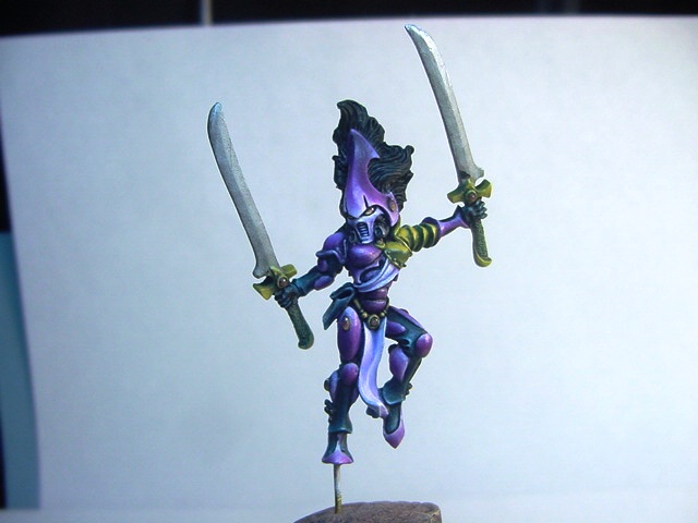
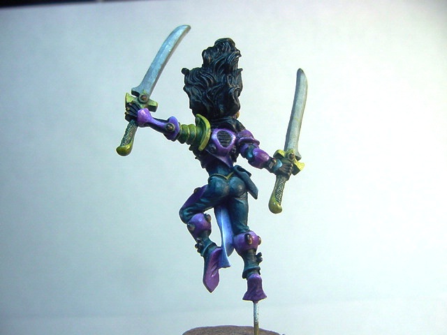
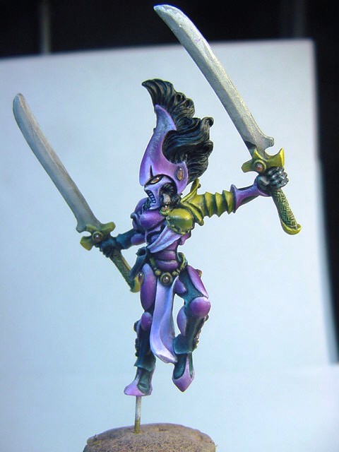
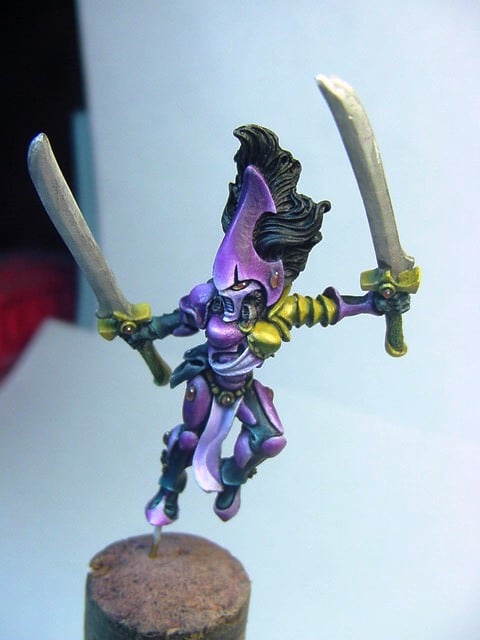
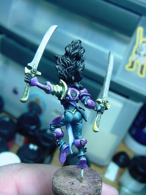
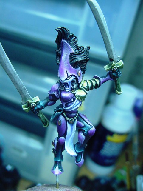
When I went to my last Games Day Golden Competition, I wanted to enter a howling banshee. To make it stand out, I opted to paint it primarily purple with a contrasting gold armor detail. I began with a lower body conversion between a couple of different banshee models and did an arm swap so my model would look like it she was at the ready and looking for her next opponent.
The model was primed in black as it was going to be a primarily dark model and black primer is best suited to this end. The body suit under the purple armor was black. It is tempting to leave the primer and just begin highlight, but for a Golden Demon, or other high level competition, you really can’t cut corners. The judges, and most of the serious contestants, can spot shortcuts fairly quickly and eliminate you from the completion.
I painted a base coat of GW Chaos black all over the model. Once dry, I mixed into the black a little bit of GW Hawk Turquoise, just enough that the black didn’t look quite black anymore. It was approximately a 3 parts black to 1 part turquoise. This was used as the main color and the black was left as a shadow. I mixed up a thin mix of Hawk Turquoise and water and began blending up the color, adding in a little P3 Morrow White as a final highlight. From the model there is not actual white showing, but it did help to ever so slightly lighten the dark blue highlight color without having to go through multiple different highlight colors.
The Gold armor details are a base color of P3 Moldy Ochre and a little GW Snakebite Leather. The shade color for the armor is GW Dark Angels Green.
“But Gar, you used green to highlight a mostly yellow color? Why would you do that? Its seems pretty weird.”
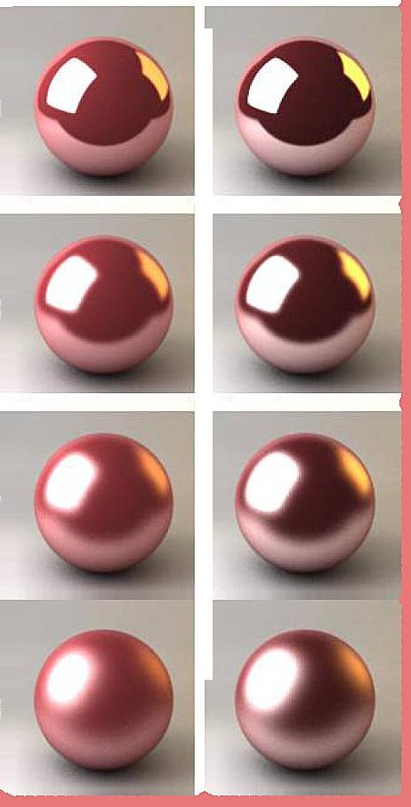
In a very a stereotypical sense, it is not a normal shade, or even close for a yellow color. My reason, the overall color of the model is purple with a yellow contrast. There really isn’t any place in the model for a brown or red-brown without disrupting the “feel” of the figure. She is meant to be mysterious, alien, distant and other-worldly. The purple pushes this feel so I don’t want to clutter it up with introducing too many colors or to take away from the face mask which is one of the central features your eye will be drawn to. On the color wheel green is between blue and yellow. Purple is between blue and red. Both Purple and green, to a lesser extent, are cool colors. So to keep the theme or feel predominantly cool and mysterious, I use green to shade the yellow. I followed a standard Non-Metallic Metallic technique with a level of reflection that is not the same as a mirror finish, but is sharp enough to have a Sky and Earth reflection. By sky and earth I will create a reflection of the horizon on my model.
Sky and Earth is also used mostly to reflect the blue sky and brown earth. My metal is a yellow gold, so I used different shades of yellow and green instead of blue and brown.
I added P3 Black and White to highlight and darken in the most extreme locations. At the horizon, a thin line of white and black-green are used to identify the horizon. I gradually blended up the layers using a round reflective model as a guide to help me make sure I get it right. I included a sample image you reference. The real trick to all NMM is to get the lighting right. It’s not the easiest thing to pick up, and even having practiced a fair amount, I still find myself making mistakes in getting it right. My advice is to practice and keep working at it if you are so inclined.
The very edges of the metallic were touched with GW skull white on the very sharpest edges and corners. You have to be careful about adding to much white. It should be used the least, only to accentuate the brightest raised points on the metal.
Next article I will go over the hair, sword blades and the base and ultimately how I did in the actual competition.
What things to you all find as a challenge or daunting? Drop me a note, I’m more than happy to offer my thoughts on painting minis or models!