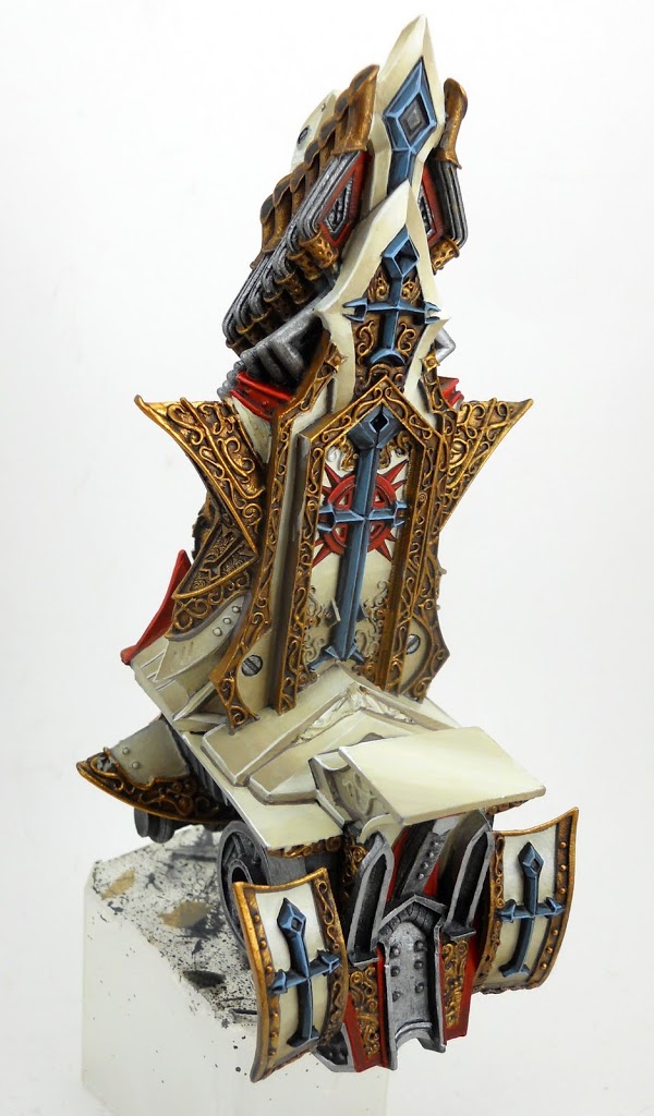
Painting: Protectorate Vessel of Judgement
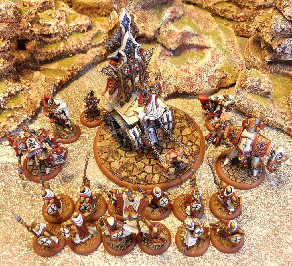
Despite a few setbacks, I’ve finally finished my Vessel of Judgement. It was quite a task, but definitely worth the effort.
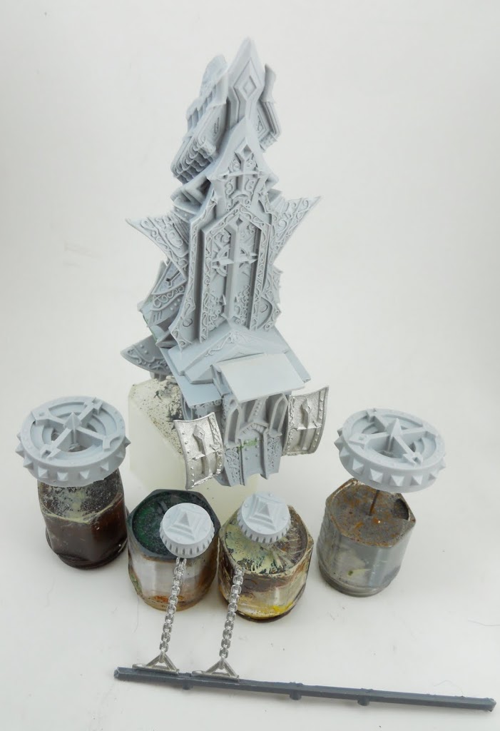
The first thing you’ll need to do is get the pieces ready for painting. I decided the wheels absolutely had to be separate from the body. I also glued the chains to an old piece of sprue plastic so I could hold onto them. At this point I had already painted the crew as part of a larger group with some solos and other things. Other than that the entire body of the Vessel was assembled completely and pinned to an old plastic container so I could have something to hold onto while I was painting it. I had to do a good bit of Green Stuffing to fill in some gaps in the back. Unfortunately I forgot to get pictures of it.
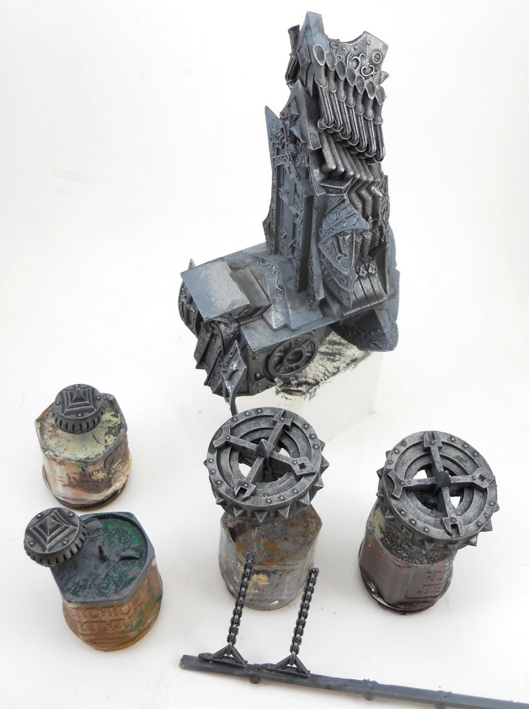
I begin by base-coating everything with a mix of Adeptus Battle Gray and Vallejo brush-on White Primer. Then the areas that are going to be steel in appearance are drybrushed with chainmail. Next I hit those areas with my custom metal wash mixed from Devlan Mud, Badab Black, Asurmen Blue, water, and matte medium. Then everything gets another drybrushing with Chainmail.
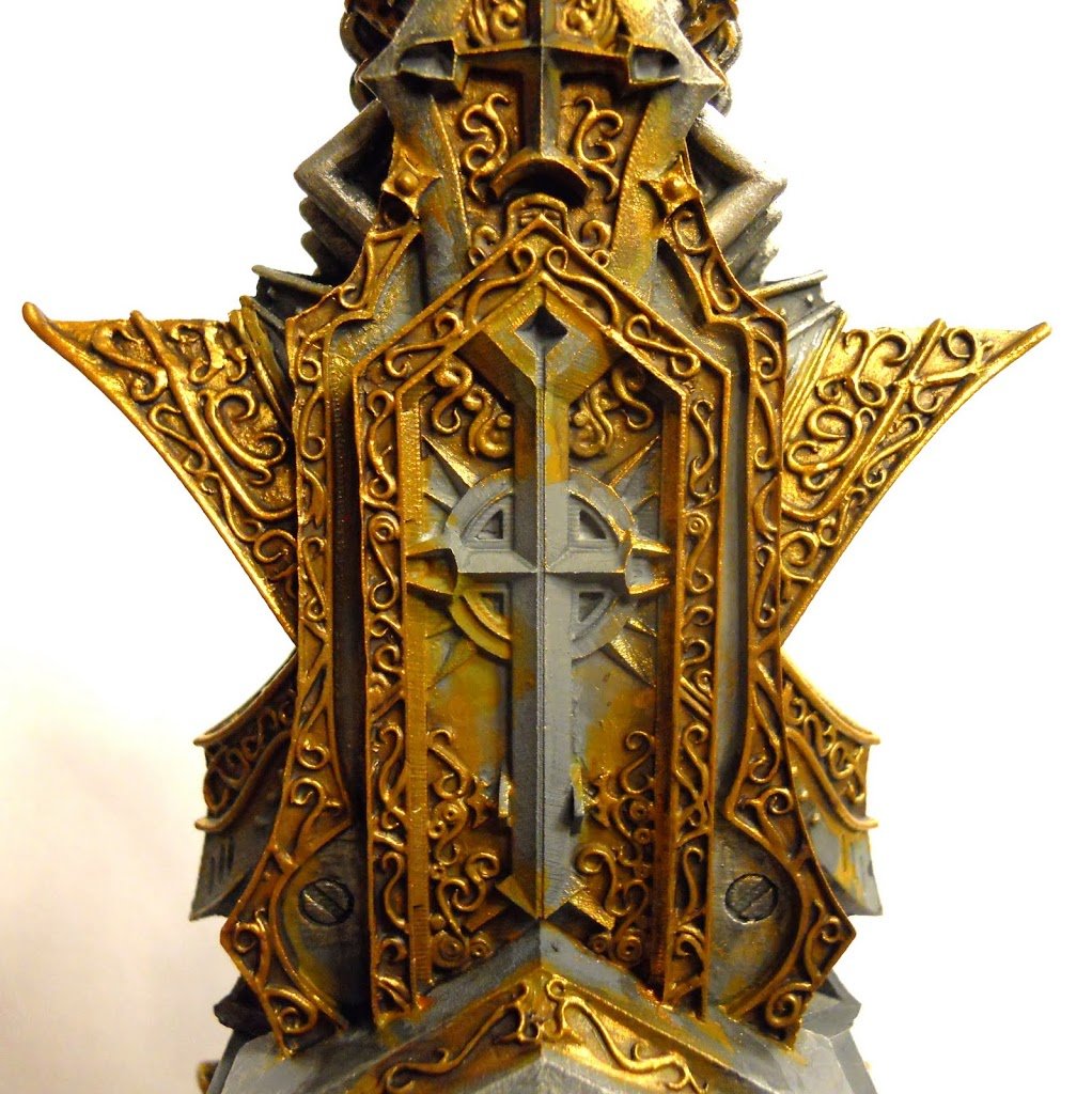 Then it was on to the golds. I did these with similar methods to the ones from this article on painting gold. But to give it kind of a grittier feel I used Devlan Mud rather than Flesh Wash, and I never bothered moving up to the Burnished Gold step using only Shining Gold. I find the easiest way to get the best results when painting any metallic is with some vigorous drybrushing. We all know that can get get messy fast so I try to get all my metals out of the way first. In my experience it’s a lot easier to touch up gold than carefully blended whites.
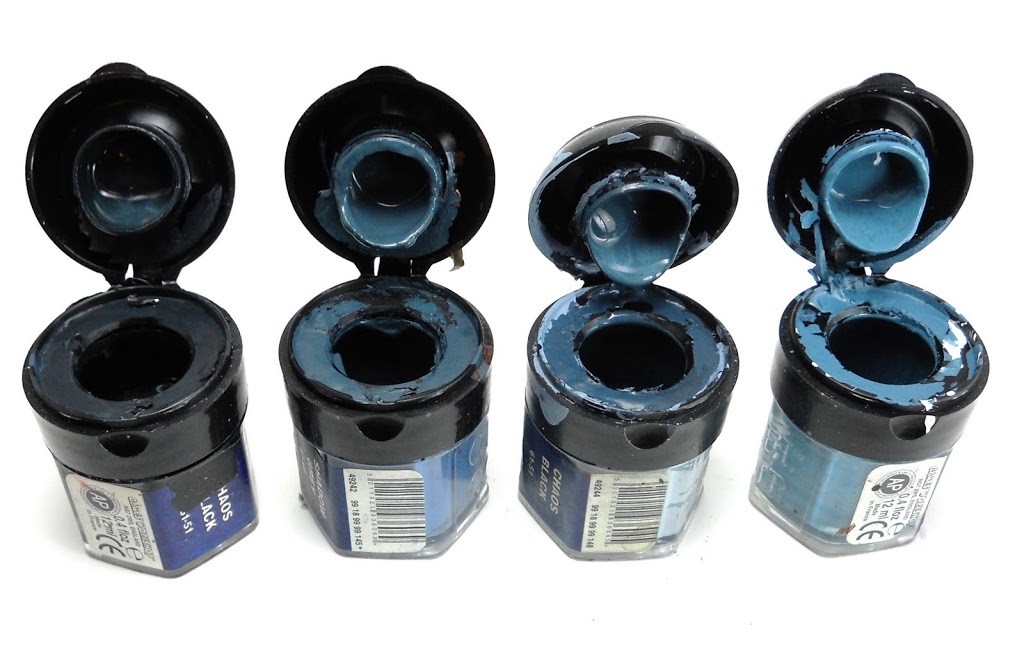
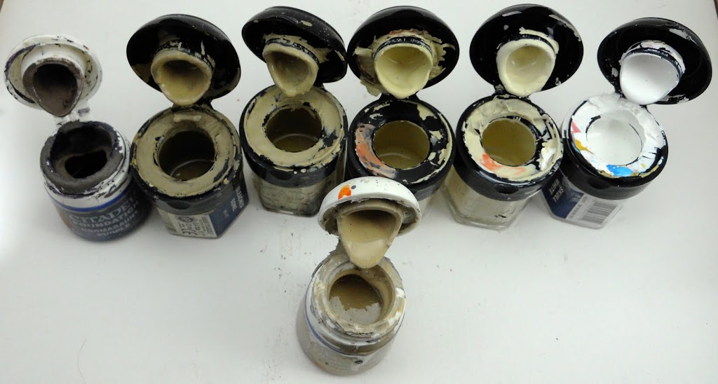 And speaking of whites, here are the pots of paint I have prepared for painting the whites on my Protectorate. The foremost pot is the basecoat: Dheneb Stone Mixed with Vallejo White Primer and just a tiny bit of Iyanden Dark Sun for color. All three of these colors are designed to cover easily and that will be important when painting over the dark grays and browns the previous steps have created. Still certain areas may require a couple of passes to ensure proper coverage before I can move on to the next step. The tone is chosen to be right in the middle of the value range I’ve got planned. That way the highlights and shadows will both go on easily.
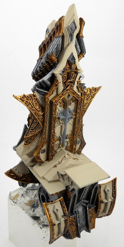 Here it is after getting a nice even basecoat.
Here the first layers of highlights and shadows have been applied. These are the middle two colors from the row of pots above. The first highlight layer is pure Bleached Bone and the first shade layer is Bleached Bone mixed with some desert yellow and just the tiniest bit of Liche Purple to darken it up a bit. The two colors are blended together at the middle by layering very thin applications of the shade color. Using thin layers is the way I usually achieve a blended look. I find it easier than true wet on wet blending. If you have trouble getting a good blend, you can always mix the two colors together to get a tone in between the two. Then apply it the same way.
The goal here is to use bands of light and shadow to define the various geometric planes that make the vessel such a unique and intriguing piece. While it’s still a little difficult to see, in the shot above move on to the next picture to see where it will end up.
 The next highlight here is Skull White mixed with Bleached Bone, and the next shade layer is the previous one with some Graveyard Earth and just a tiny bit more Liche Purple added. Be careful not to get it too purple. Now that the next two layers of highlight and shading have been applied you can start to see the definition emerge. The two areas at the top of the vessel are the best place to see this effect. Basically the various planes that comprise the piece are painted with blends from darkest to lightest. When two of the planes join at the edge, the light and dark areas contrast with each other to create definition. All the edges are also defined with a very thin line of the current highlight color. Use the side, not the tip of a medium sized brush to line edges in this way. It may take some practice to get the hang of it.
 We’re going to turn the vessel around now. The final shade color is Iyanden Dark Sun mixed with some Hormagaunt Purple and with a bit of Dheneb stone added in to lighten it up some. This final layer is applied only to the deepest recesses where two pieces meet up. It is also used to define the rivets, which are painted with this color, then with Bleached Bone leaving only an outline of the shade color visible. Pure white is used very sparingly as a final higlight in a few places. Then it’s time to move on to the reds. I start them off with a basecoat of Dark Flesh.
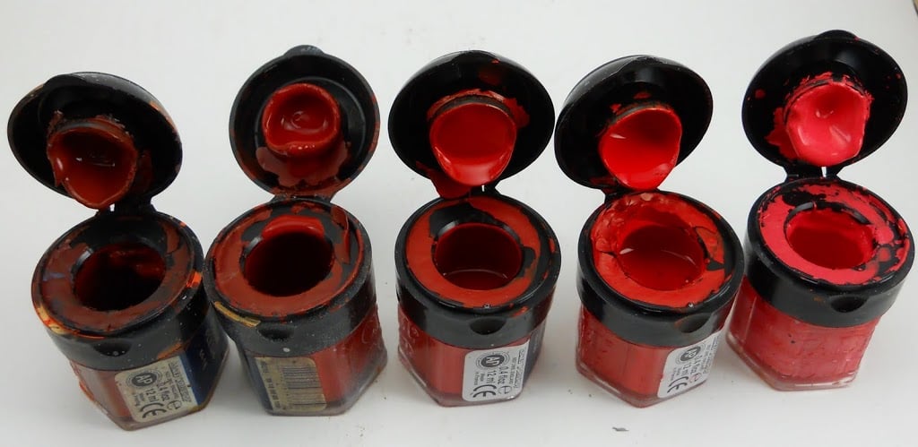
Here are the reds I use on my Protectorate. Basically we’ve got Dark Flesh with more and more Blood Red mixed in at each stage until you get up to pure Blood Red. The last highlight, which will be used very sparingly, is Blood Red with some white and orange added to it. The Orange makes it look a little less pink. 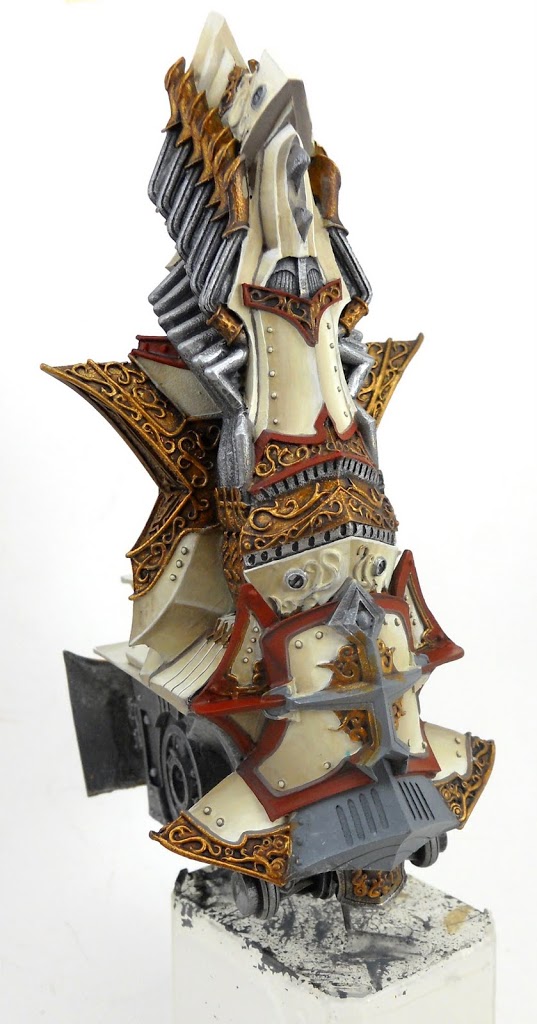
After adding a thin wash of Scaly Green to the deepest shadows (you can see where I missed with it bottom center), I start with the first highlight.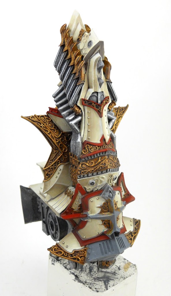
Then the next highlight layer. Again I’m mostly getting a blended effect by using thin layers rather than any wet-on-wet blending.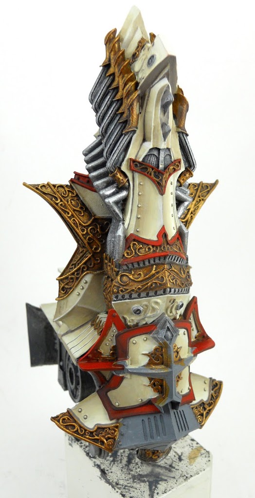 I continue with the highlights until I reach pure Blood Red. Then I use the same deep shadow color from the final stage of the whites to define the ridge around the edges of the large red area you see there near the bottom.
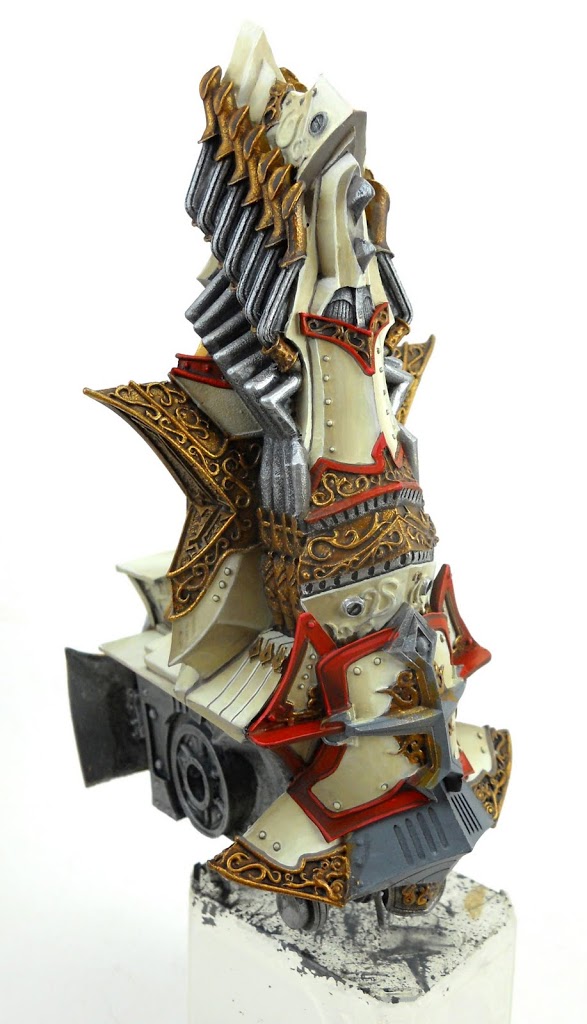 Then I have to go back and re-highlight that ridge with Blood Red again. Then everything else gets a final highlight with the last color from the shot above.
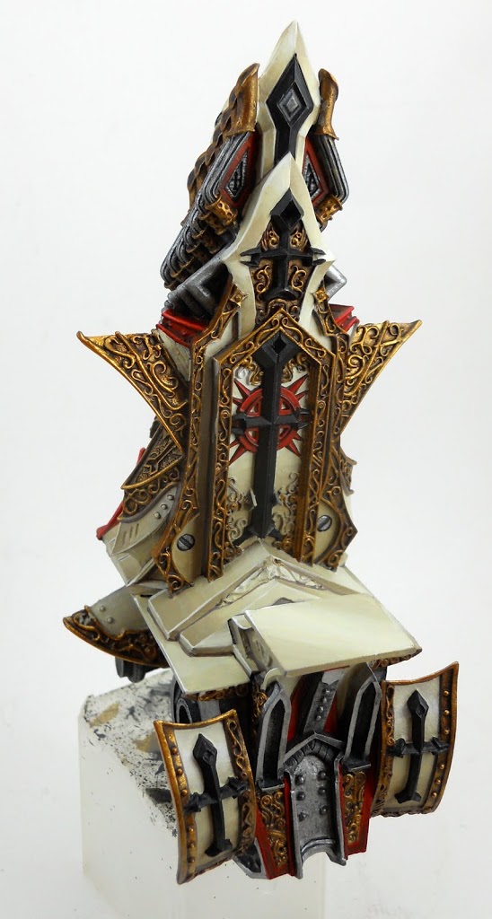
And then it’s on to the black Menofixes.
 My black highlights consist of Chaos Black mixed with Hawk Turquoise, then subsequently more and more white.
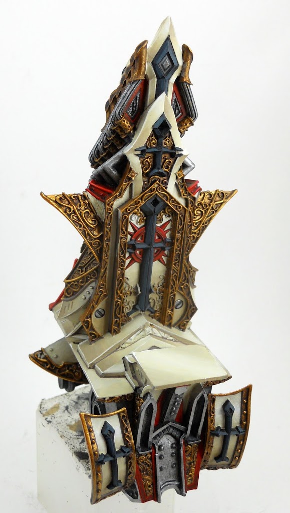
Here’s how it looks after the first highlight color is added.
I continue building the highlights up. When I’ve finished with them, I’ve got myself something that’s far brighter and shows significantly more contrast than I actually want in the finished piece.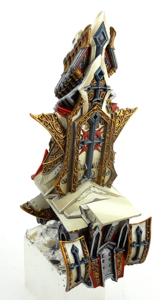
To tone it down a bit, I hit everything with the same ink that I used earlier on the steel areas. This gives it a more blended appearance and subdues the highlights a bit as well.
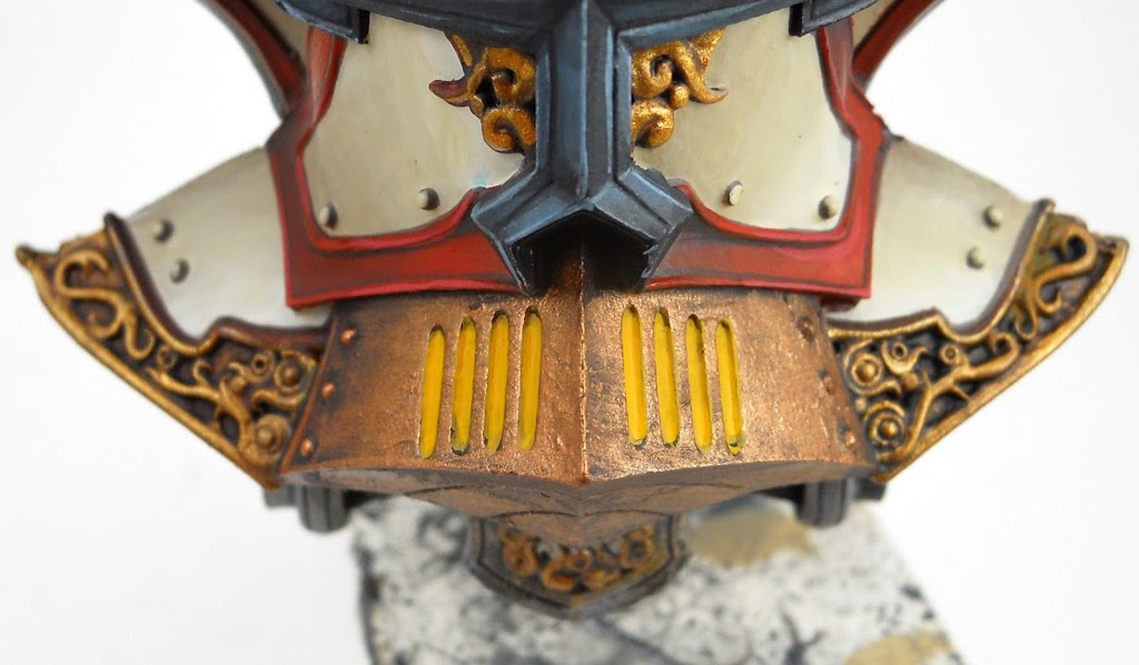
Next I paint the many vents on the Vessel. It seems only appropriate to have them glowing with the fire of Menoth’s wrath. I start them off with Iyanden Dark sun to get a nice solid base coat.
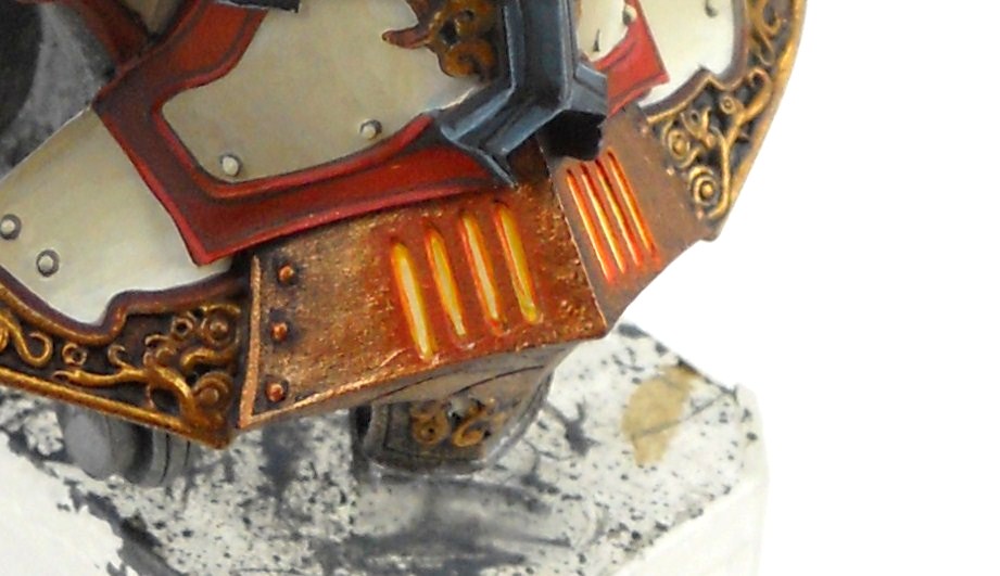 Then I paint a mix of Golden Yellow and Skull White over the coat of Iyanden Darksun. Around the edges of this, I build up a few thin glazes of Golden Yellow, then some Blazing Orange. Having the lightest color in the middle is what gives it a glowing effect. There is also a glaze of Blazing Orange around the exterior, which creates the illusion of a nimbus around the region. This will help complete the illusion that there is actually light glowing from within.
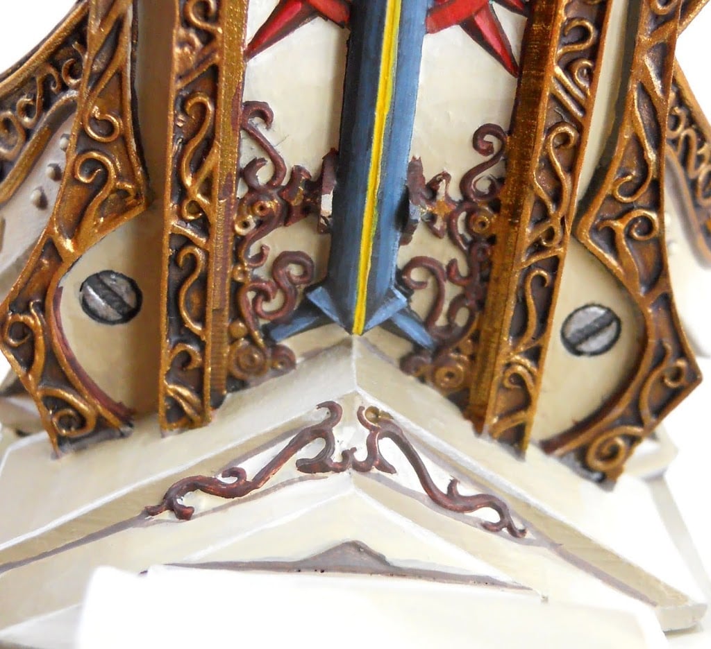 Many of the little gold details on the white have been completely covered up during the painting process. Before I paint them gold again I define them with a coat of Scorched Brown.
Now all that’s left for the carriage is to put a blue jewel up there on the top.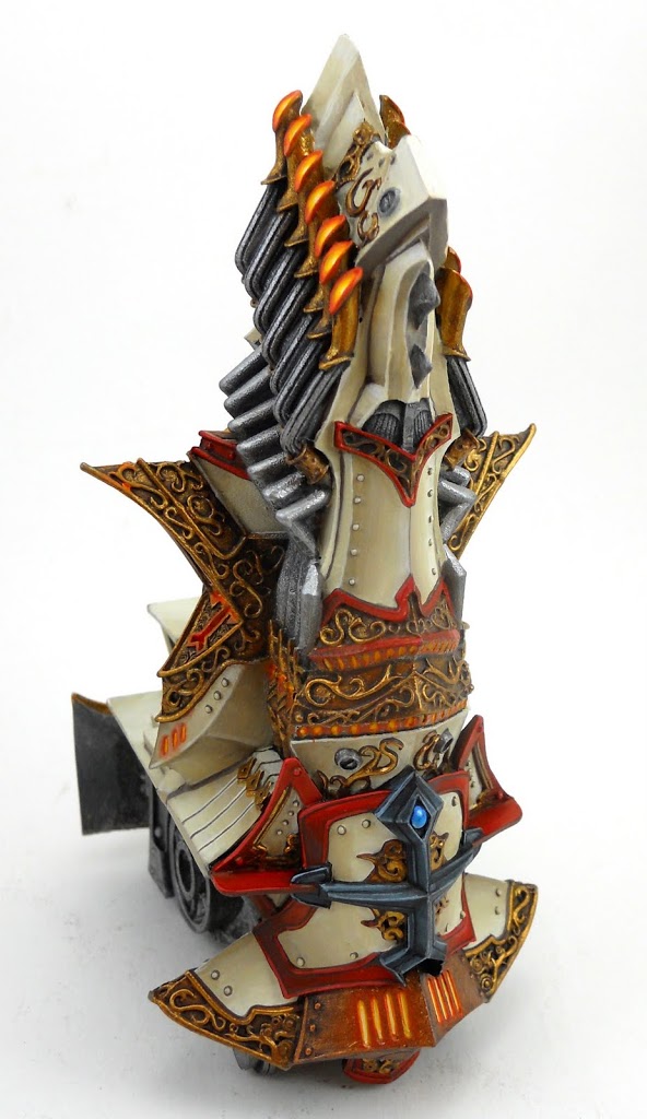
And another one in the Menofix on the back.
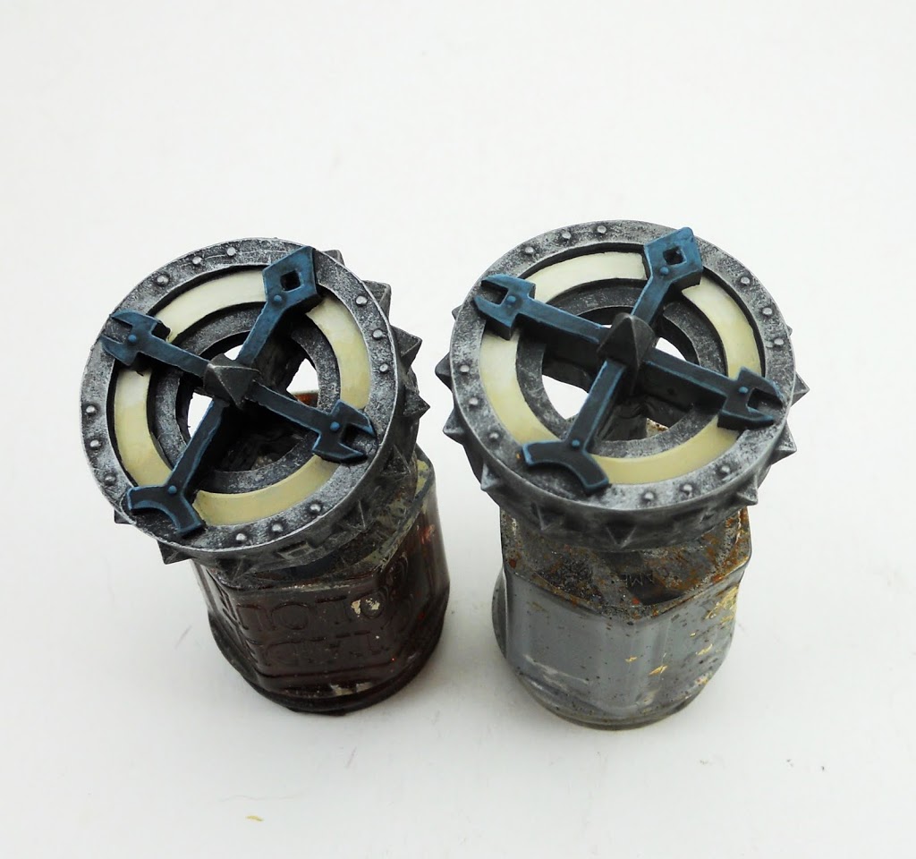
I’ve also been painting the wheels separately using the same techniques.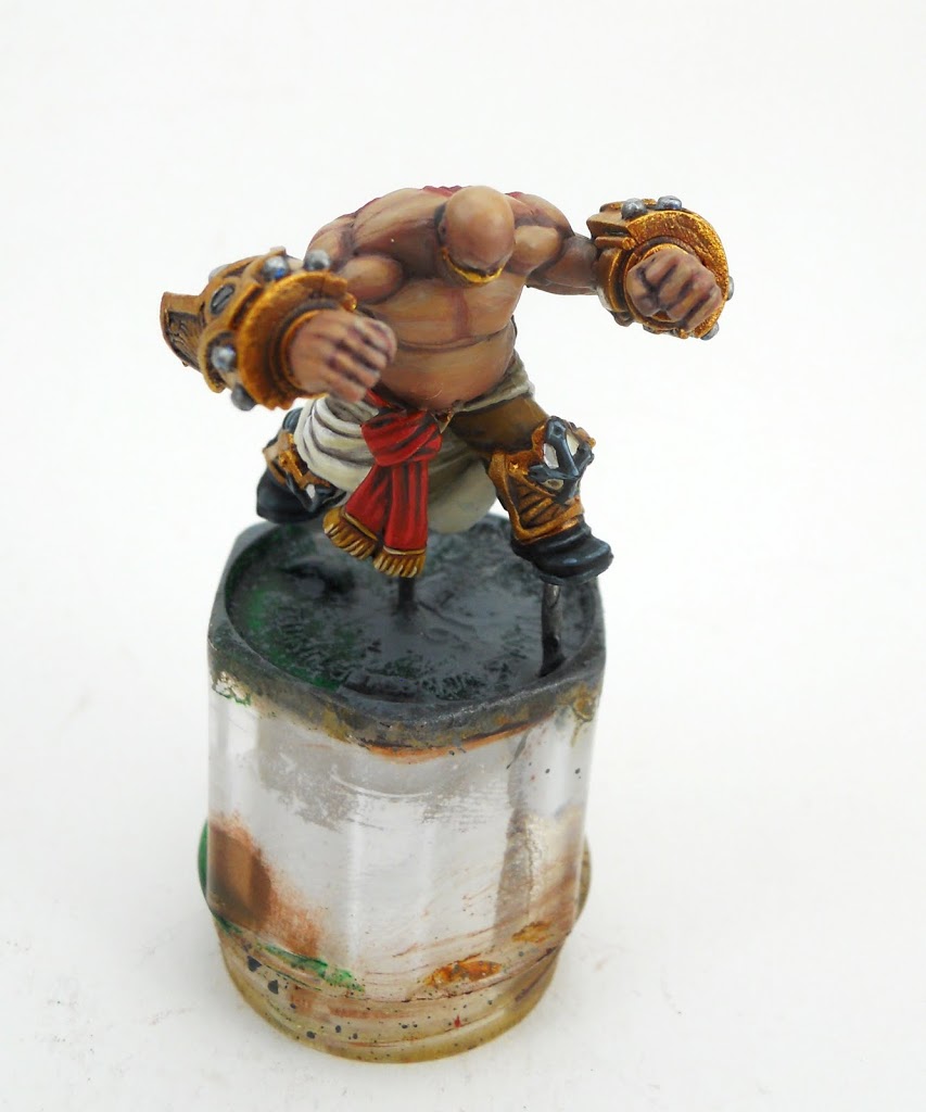
And of course the two crew were also done separately. Again, the same colors and techniques were used for the red and whites here. Check out this article for info on the skin tones.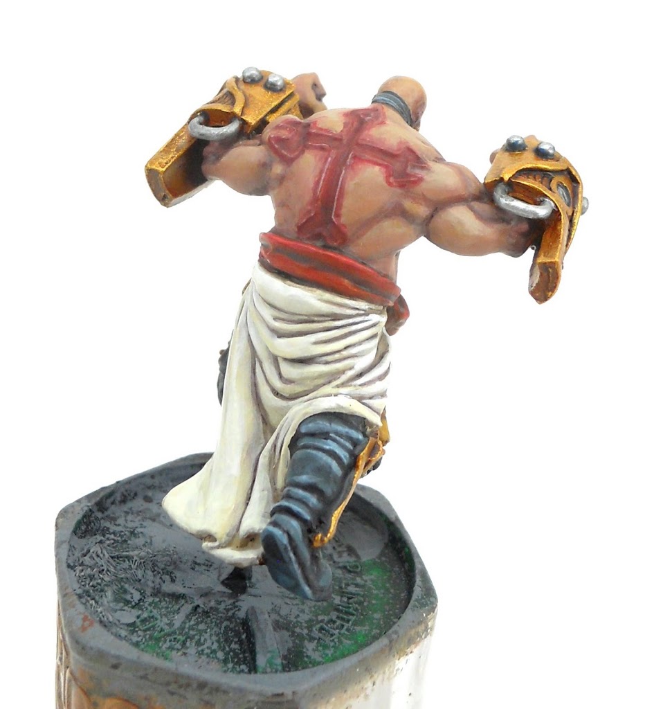
I decided to go for a “just branded” look on his back rather than old scars. It’s a fairly easy effect to achieve; just blend a little Red Gore into the flesh tones. Give the ridges an uneven but sharp bright highlight to make them look wet.
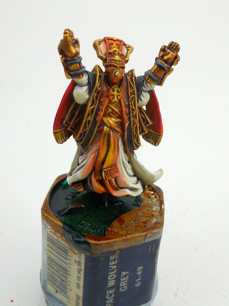
I really wish I could have gotten some WIP shots of this guy, but doing the OSL was a very involved process. I actually wasn’t planning to do anything like this at first, so I just painted the priest like I would have any other Protectorate infantry. Once I decided I had to try for the effect, the first thing I did was to simply drybrush Blazing Orange, and then Golden Yellow in a streak down the middle. This let me get a feel for everything before I started blending it together more smoothly.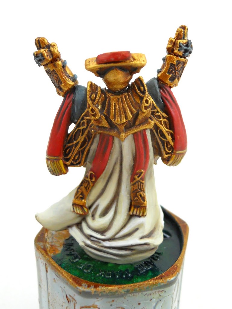
And here’s a back shot.
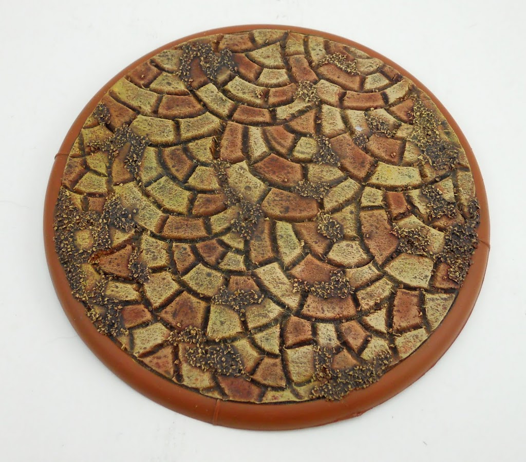 I made a custom base for it using the same technique I wrote about here.
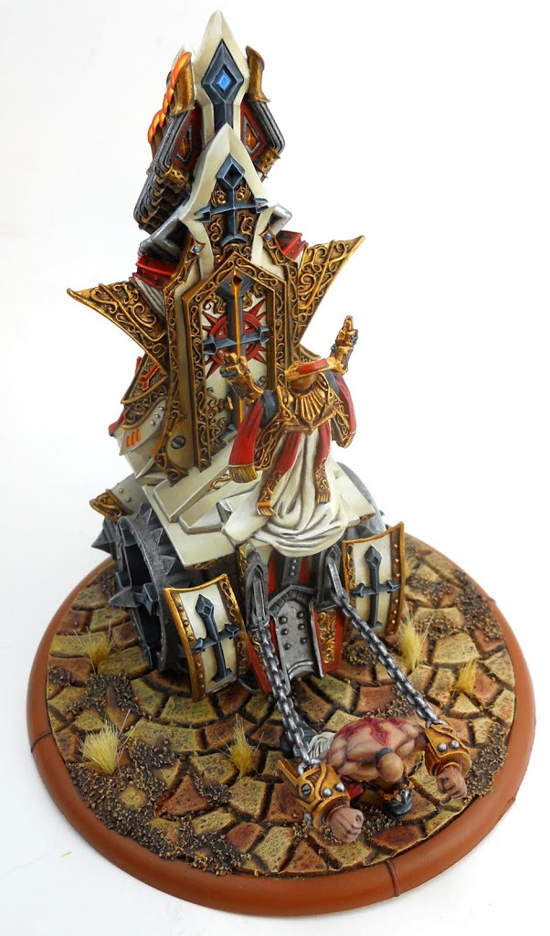
Pinning it to the base while lining up the strong-man to ensure he is the right distance away to fit in the chains is a challenge unto itself. But there it is, finished at last.
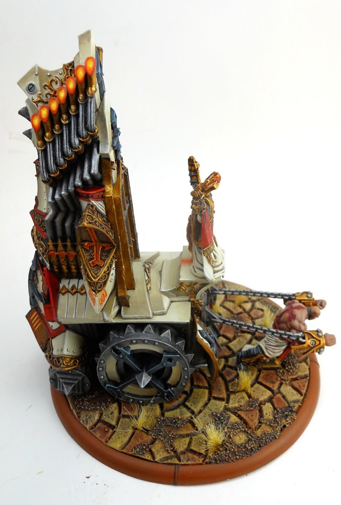
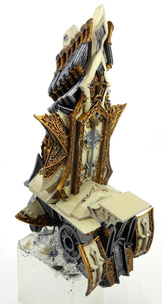
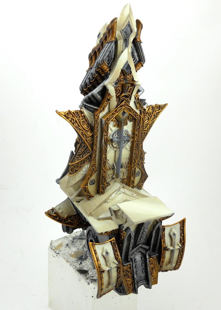
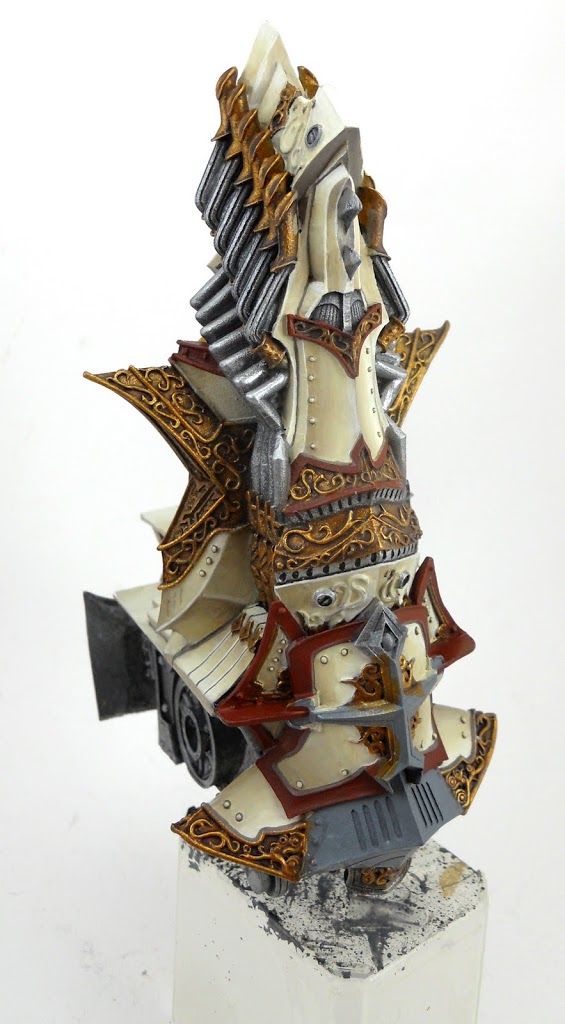
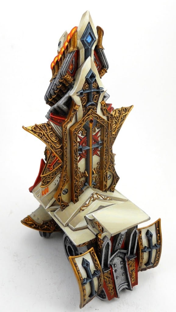
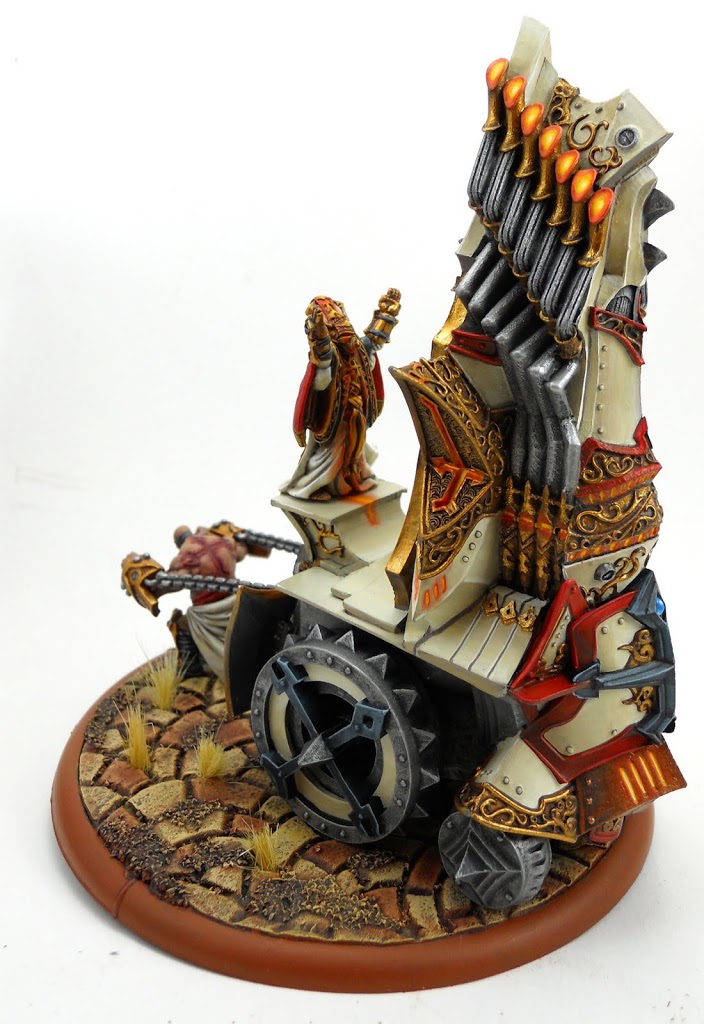 ~ And there’s a few more angles. Let me know what you think, and share any good battle engine stories you’ve got!