Codex Harlequins Artwork – End of the Grimdark?

![]()
DrLove42 here to talk about one of the most outstanding (and untraditional) features of the newest codex out – the Harlequin Codex artwork.
Over the next days and weeks the internet will fill up with posts about x unit, or y wargear and z physic power from the Harlequin codex. Don’t get me wrong, the codex seems solid. Its the glassiest glass cannon we’ve seen in a long time, but its also carrying one of the biggest payloads. And if it delivers that load on target its going to hurt.
But I’m not here to talk about that. I’m here to talk about the stand out excelling feature of the codex – the artwork.
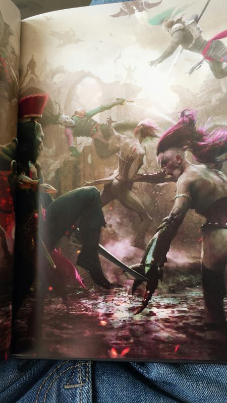
Everyone knows the typical artwork of GW codices. They’re a mix of big dynamic battle sequences, recoloured old style artwork and a splash of Mister J Blanches’ artwork. They’ve delivered some standout examples of art and have really set the grimdark setting we have come to expect – and the same on the Fantasy side of the line
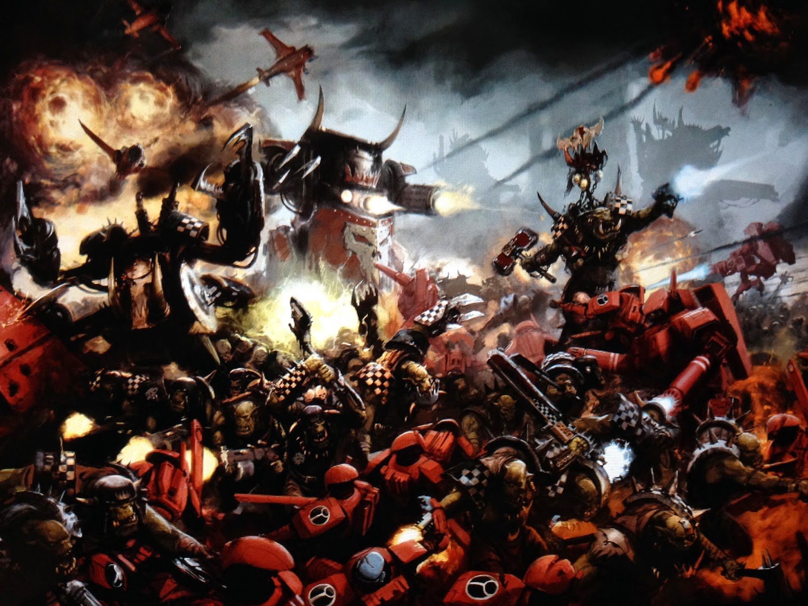
Fairly Standard GW artwork – Grim, Dark and Death…I think from the Ork codex
Then this morning I opened the Harlequin codex. And flicked through. The first thing that sprung to my mind was just how gorgeous the new artwork spreads were. The second was just how different they were to the usual GW art style. It wasn’t grim. It isn’t all that dark. Its clean. Bright. Colorful even. bear in mind these photos below are from my crappy camera phone, slightly compressed by the uploading software. In person these are absolutely stunning.
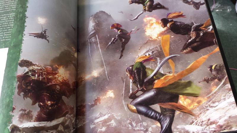
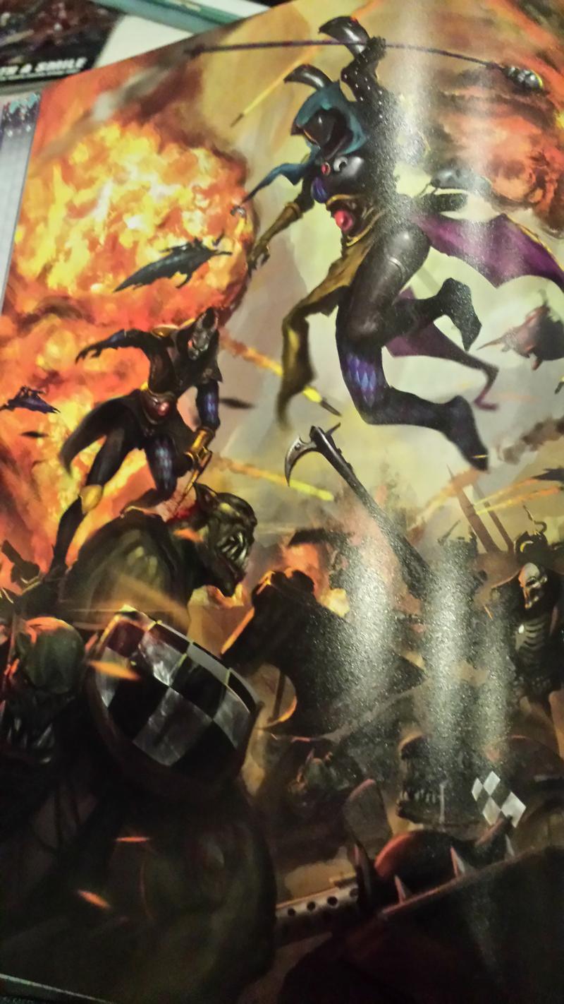
I hope you can see what I mean in these images. They are just incredible to look at. And so removed from the normal codex art style.
I’ve always been a fan of GW artwork. I know people will complain these aren’t grimdark enough to represent the universe. Personally I think it really suits the Harlequins are the bright shiny dancers they are. And I like the change and risk in using this new style in the codex. Its really paid off.
Its also worth noting, that as Harlies have been fairly under-represented in the past, there are only one or two piece of recycled artwork in the entire book. Everything else is brand new, something I don’t think can be said for any other codex in a while. And (something I am personally thankful for) not a Blanche art style to be seen!
Between this book and the high quality of the End Times books for Fantasy, GW really has mastered the high quality printing angle. People will inevitably complain prices have gone up, but you compare the current visual quality of the new books to those from 4th or even 5th edition and in my opinion the cost increase is absolutely justified
More talk about the Harlequin Codex art (as well as a few more art shots) can be found here